
When crafting a high-converting website, you need to strike the perfect balance by blending innovative ideas, captivating images, and persuasive words.
The final touch is crowning your masterpiece with the ultimate CTA (call-to-action) – the make-or-break moment where your audience decides to jump in or bow out.
Now, imagine if this CTA misses the mark.
It’s like watching a thrilling movie that fizzles out in the final scene. Definitely not the experience you’re aiming for.
CTA Mistakes to Avoid
To prevent that, we’re going to identify the common CTA mistakes that even the best of us make.
These CTA mistakes can unintentionally slam the brakes on potential conversions.
More importantly, we’ll help you transform your CTAs from overlooked elements to the champions of your marketing narrative.
1. Being Too Flat with Your Wording
Do you have the bad habit of sticking to a rigid, one-dimensional approach to wording?
It’s like serving the same bland dish at every meal. It might fill the plate, but it won’t excite the palate.
When your CTAs sound generic or robotic, they fail to resonate with your audience. In fact, they’ll simply blend into the background noise of countless other digital messages.
Enter the power of first-person phrasing. It’s like shifting from a monologue to a conversation.
By using “I” or “My” in your CTAs, you create a direct line to your audience’s personality.
This approach fosters a personal connection. It can make the CTA feel like an invitation from a friend, rather than a command from a brand.
Imagine a CTA that reads, “Download Your Free Guide,” compared to “Get My Free Guide.”
The latter is less about the action and more about the relationship.
It speaks directly to the user, making them feel as if they’re personally receiving a valuable resource.
Let’s see this strategy in action with Digestive Warrior, a health supplement brand.
They smartly place a CTA under an interview video with a medical expert: “Check Out My YouTube Channel.”

This feels like they’re reaching out personally, encouraging viewers to explore more content.
The subtle tweak in wording creates a more engaging and personal appeal, likely leading to higher click-through rates.
It demonstrates a clear understanding of the power of personal connection in digital marketing.
2. Using Vague or Generic Labels
Imagine landing on a website with CTAs that only say “Buy,” “Submit,” or “Click here.” How fast do you exit and move on to your next choice?
That’s what happens when CTAs are vague or generic.
If your CTAs are too broad or non-specific, such as “Continue” or “Shop,” they fail to ignite curiosity or provide direction.
This lack of clarity can leave potential customers feeling lost or uninterested, leading them to navigate away from your page.
The key lies in crafting CTAs that are both descriptive and precise. Your goal is to paint a clear picture of what awaits on the other side of the click.
By specifying the action or value proposition, you guide your audience through their journey with you.
For instance, instead of a generic “Download,” try “Download Our Free Meal Prep Sheet.” This messages instantly tells the user what they’re getting and why it’s valuable.
Descriptive CTAs work because they remove the guesswork. They reassure your audience that they’re making the right choice by engaging further with your content or offers.
For a great example, check out the Houzz homepage.
The platform tells its readers: “Here’s what you can do on Houzz” and then places four CTA buttons next to each other:
● Discover Design Ideas
● Shop Products
● Browse Pros
● Suggest Pros for Me
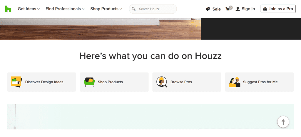
Each CTA offers an immediate choice and clarity. They are all straight to the point, engaging the user directly and telling them what will happen when they click on the CTA.
The symbols next to the words are also a great touch to further highlight their calls to action.
This approach showcases how you can effectively steer users toward a more personalized and relevant experience. All you need to do is remain clear and specific in your messaging.
3. Lacking Visual Cues
Without visual cues, CTAs can become ambiguous. And ambiguous CTAs leave users uncertain about what to expect.
Think of it like trying to find a door in a dimly lit room – if users can’t easily see where to go, they’re less likely to take that path.
Visual ambiguity in CTAs can lead to hesitation, reducing the likelihood of a click-through.
Why? Because users often rely on quick visual signals to guide their online actions.
To clear up any ambiguity, try integrating descriptive icons with your CTAs.
Icons serve as visual shorthand, conveying a message at a glance. They set clear expectations about what the CTA offers.
For example, by adding a shopping cart icon to a “Buy Now” button, you’ll make it extra clear that it leads to a purchase.
This clarity can significantly enhance user experience by making navigation intuitive and helping accelerate decision-making.
Descriptive icons work, because they align with the way our brains process information.
We’re naturally drawn to visual elements. When these visuals clearly indicate action, they can significantly enhance the effectiveness of your CTAs.
Let’s look at Lanteria, an HR management platform.
They could have simply used a text-based “Product Tour” CTA, but they chose to add a play icon to it.
This small but impactful addition clarifies that clicking the CTA leads to a video tour.
It sets immediate, clear expectations for the user, indicating an interactive, visual experience rather than just a text-based page.

This approach sets clear expectations and reduces user hesitation.
It also enhances the user experience by providing a quick, at-a-glance understanding of what the CTA offers.
4. Limiting the Use of Color Psychology
Color is not just a part of design, but a language in itself.
Underestimating the role of color psychology is like speaking in a monotone – it fails to capture attention or evoke emotion.
When CTAs blend into the background or don’t visually pop, they can easily be overlooked by users.
This is especially true in a digital landscape crowded with information and stimuli.
To better embracing color psychology, choose hues that stand out and harmonize with your overall design and brand identity.
The right color can act like a visual shout, drawing the eye and prompting action.
It’s about understanding how different colors affect mood and behavior. For example, red can evoke urgency and excitement, whereas blue can convey trust and stability.
In any case, keep in mind that it’s crucial to strike a balance.
The CTA color should be distinct enough to stand out but not so jarring that it disrupts the user experience.
It’s about creating a visual hierarchy where the CTA is the focal point without overwhelming the rest of the design.
Take Sokisahtel, a clothing brand, as a case study.
In a smart move, they use navy-colored CTAs labeled “Look Here,” contrasting sharply with their signature red color scheme.
This choice is strategic – the navy CTAs catch the eye amidst the sea of red, guiding users’ attention effectively.

This contrast creates a visual pathway, leading the user’s gaze directly to the CTA.
The navy color, being both distinct and sophisticated, enhances the CTA’s visibility while maintaining the aesthetic integrity of the website.
5. Using Passive or Weak Verbs
The verbs you choose for your CTAs are more than just words. They’re the fuel that drives action.
Passive or weak verbs in CTAs lack the energy and urgency needed to motivate users to take action. This can result in missed opportunities for engagement and conversion.
The remedy is to employ strong, action-oriented verbs in your CTAs.
These verbs act as psychological triggers, creating a sense of excitement and immediacy.
They’re like the green light at a race start, signaling users to go ahead and take action.
Words like “Discover,” “Explore,” “Start,” and “Get” are both imperatives and invitations to an experience, encouraging users to be a part of something.
These dynamic verbs do more than just describe an action. They create an emotional response, making the user feel empowered and eager to participate.
The right verb can transform a mundane CTA into an irresistible call to adventure.
Consider the approach of Key One Realty Group, a Dubai-based real estate agency.
On their homepage, they could have gone with a standard “View Listings” or “Learn More.”
Instead, they chose “Search Property” as their CTA to complete their search tool. This choice of verb is intentional and effective.

“Search” is an active, engaging verb. It suggests a journey, an exploration of possibilities.
This approach fits perfectly with the nature of real estate hunting, which is often an active and personal endeavor.
It invites visitors to actively engage with their property search tool, setting the stage for a more involved and interactive user experience.
6. Missing a Personal Touch
CTAs are functional elements and a reflection of your brand’s personality at the same time.
When they lack a personal touch, they become forgettable, just another generic prompt in a sea of digital noise.
This impersonal approach can fail to resonate with users, lacking the unique flair that makes your brand stand out.
It’s like having a conversation without showing any emotion or personality. It won’t leave a lasting impression.
To make your offer memorable and engaging, infuse your CTAs with your brand’s unique personality.
This involves crafting creative, brand-aligned phrases that speak directly to your audience’s desires and needs.
This approach turns a simple call to action into a memorable brand experience.
It’s all about moving beyond the functional aspect and creating an emotional connection.
Your CTA should feel like a natural extension of your brand voice, echoing its values, tone, and style.
TeuxDeux, a to-do list and organizer app, exemplifies this strategy beautifully.
Instead of generic CTAs like “Start Planning” or “Get Organized,” they use phrases like “Organize in peace,” “Simplify your day,” and “Reduce the noise.”
Each of these CTAs is a reflection of their brand’s core focus: simplicity and organization
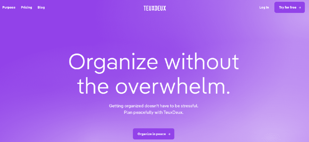
These CTAs do more than instruct. They communicate the essence of the TeuxDeux experience.
By using unique, brand-aligned phrases, this brand sets itself apart, making its CTAs an integral part of its brand storytelling.
Final Thoughts: Rise Above CTA Mistakes
We’ve journeyed through the common CTA mistakes and discovered how tweaking a few key elements can turn them from conversion blockers into conversion boosters.
The main takeaway is to not leave your CTAs to chance. Infuse them with creativity, clarity, and a dash of your brand’s unique personality.
Whether it’s choosing the right words, colors, or visual cues, each element plays a pivotal role in making your CTAs not just seen but felt.
It’s all about creating a conversation, an experience, and a connection that goes beyond the screen.
Updated December 9, 2025
Catherine Palmer
Latest posts by Catherine Palmer (see all)
- 6 Common CTA Mistakes That Are Killing Your Conversions - December 13, 2023
- 9 Types of Unique Content for Marketing (+Examples) - August 4, 2023
- 7 CTA Best Practices to Increase Conversions + 10 Great Examples - June 1, 2023