In today’s world, companies have a lot of challenges to overcome if they want to win a share of the market.
Everybody’s doing digital marketing, and it is not a secret. However, not everybody does it equally well.
Therefore, you need to find a way to evaluate your online marketing efforts continuously, so you can fix any issues you might be experiencing quickly.
Heat maps are one of the best ways to do fix problems on your website.
Heat maps allow you to see what the visitors are doing once they come to your website.
They can help you realize:
- Whether or not there are some things you need to do better
- What parts of the pages they find most interesting
- How you can increase your conversion rate, and much more
Read on to learn more about how heat maps help you improve your business!
What Are Heat Maps?
A heat map (or heatmap) is a color-based visual presentation of how the visitors interact with your website.
In other words, heat mapping software uses colors to present what parts of your website are the most interesting to potential customers.
With this information, you can see what is and is not important, according to the behaviors of your website visitors.
You can also determine whether important parts of your website (such as CTAs, contact forms, etc.) should be moved or adjusted for increasing the CR (conversion rate).
How to Use Heat Maps and What Information They Provide
There are different types of analysis heat maps provide.
Here are some of the most common ones:
- Scroll map – How many visitors saw each part of a particular page
- Click map – Where the visitors clicked the most
- Link map – What links gained the most clicks
- Form analysis – The interaction with the website’s forms
- Sessions replays – The actual replay of each visit to your website
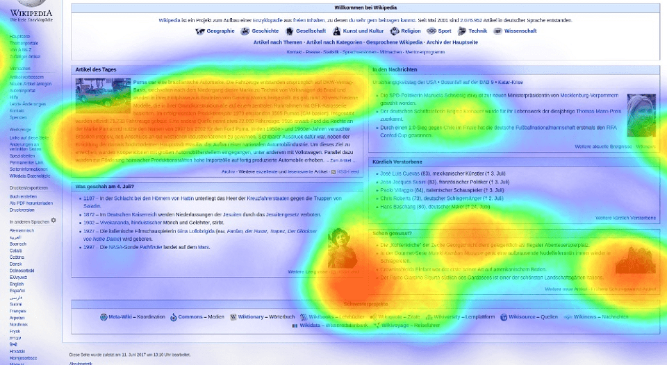
Scroll Maps
As the name suggests, the scroll map allows you to see how many visitors reached each section of a particular page on your website.
You can check this information for each page on your website.
Plus, you can set up segments that include the visits that you find the most important according to different parameters: location, age, interests, device, browser, language, etc., or even exclude the visitors that you don’t find important.
Here is what a scroll map looks like:
The stronger the shade of the red, the more visits that part of the page had.
Plus, the heatmap tools also provide data on how many visits that page had in total and how many visitors viewed each part of the page, so you can come up with conclusions based on the exact information.
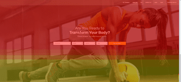
Click Maps
Click maps show areas, buttons, and forms where visitors clicked.
This will allow you to see if the customers understand what your calls to action are, or if they click on other parts of the website as well.
If you find problems on the click map, you might consider placing your buttons in some other area, making them stand out more, or changing their labels / CTAs.
In any case, click maps will definitely show what might affect your conversion rate negatively, or what adjustments you might need to increase the number of conversions.
Here is what a click map looks like:

Link Map
A link map shows what links on your page gained the most clicks.
Red means the most, no color means none.
In between, the links painted closer to red gained more clicks, while links painted closer to green had fewer clicks.
Link maps help you realize what is more and what is less important for your website visitors.
This in turn gives you an idea of how you can make your website more useful for your potential customers.

Form Analysis
Form analysis gives you an insight into:
- How many visitors interacted with the forms on your page
- How many among them filled out the information
- How many sent their data at the end
This will let you know what step causes the most ‘drops’ in form engagement, or whether or not an acceptable percentage of visitors interact with the form.
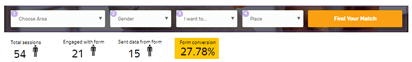
Having this information will help you with suggestions on how you can improve the UX (user experience) or if you should make your form more engaging/shorter/multi-step etc.
For example, you can create an A/B test, and check if a multi-step form influences the rise in the number of sent forms (because asking fewer pieces of information at the same time sometimes appears to be a better solution than asking for all pieces of information at once).
Sessions Replays
Session replay shows what each visitor did on the website.
This can include things like:
- How they moved around the website
- Where they spent most of their time
- If they used left- or right-click on a particular part of a page or post
- What links they clicked
- Where they clicked because they thought it was a link
- What part of the content they copied
- How much they spent on each page
Also, scroll maps provide different pieces of information about each visitor – what country they are from, what browser they use, what device they used when visiting your website, etc.
So, with all of this data, you can see if there are any issues affecting visits from particular devices, territories, or browsers.
On the other hand, you will also be able to see what opportunities you have, considering each of those categories.
Here is a screenshot of one session replay:
How to Implement Heat Maps on Your Website
There are different types of software that are capable of generating heat maps.
Also, there are different marketing tools that can assist with this.
For most of them, implementation is quite simple.
You only need to create a code snippet (the tool or software you use will guide you through the process of creating the snippet), insert it between <head> and </head> tags of the page, and that’s it.
After a few minutes to a few hours (depending on the tool/software), you will be able to start tracking the above-mentioned heat map metrics.
Here are some of the most commonly used software solutions for heat maps:
Bottom line: What’s in it For You
With all the information heat maps offer, you will have plenty of ideas on how to improve the overall experience of your website’s visitors.
This will, in turn, make your website more engaging, better tending to the needs of your potential customers.
And satisfying the needs of your customers will lead to more conversions, better ROI and eventually to the goal of each marketing campaign – more profit at the end of the day.
Feature Image Credit: CC 0; Public Domain. Feature image sourced from Wikimedia Commons.
Disclaimer: The views and opinions stated in this post are that of the author, and Return On Now may or may not agree with any or all of the commentary.
Updated October 30, 2025
Jacob Daniels
Latest posts by Jacob Daniels (see all)
- Heat Maps: What They Are and How to Generate One - November 10, 2020