The average conversion rate for landing pages across all industries is 2.35%.
It doesn’t sound like a lot, and you may feel quite good about yourself if you’re already seeing better numbers for your own marketing campaigns.
If you want to break into the top, though, you’ll want to aim for conversion rates of around 10%.
Perhaps surprisingly, desktops have higher conversion rates than mobiles.
This means that, paradoxically, you will have to focus on mobile-first indexing to rank well
Meanwhile, you should never neglect your desktop website, as it is likely driving more sales.
What High Converting Landing Pages Do Better
Here are eight key elements to consider implementing on your landing pages (adapted for both desktop and mobile) that will help you get into those double digits:
Value Above All Else
First and foremost, let’s talk page organization.
Whichever elements you use to tell your story and share information, your ultimate goal should be to provide value.
It works for search engines and it works for customers, who will not bother giving you the time of day if your only goal is to sell them something.
What value means will depend on each page.
In the shortest terms possible, providing value can be described as “giving all the information a lead would need in order to make a transactional decision.”
On product pages, that will mean including several high-quality, relevant images, product descriptions, customer reviews, and delivery information.
On service pages, it will involve describing the expected outcomes and deliverables.
On product category pages, it will require you to highlight the benefits and explain the top-level information about a specific category of product.
Kuru Footwear has a great page about orthopedic shoes that checks all the boxes.
It’s relevant, informative, hierarchically well-organized, and offers plenty of chances for conversion.
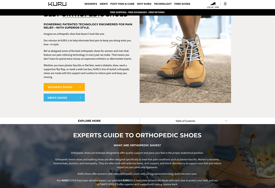
Source: kurufootwear.com
Show All Relevant Information
Speaking of value, let’s also touch upon the importance of listing all the information that will help your leads convert.
You already know what some of the most important elements are: delivery information, reviews, quality images, etc.
An important catch to keep in mind is that you don’t need all information on every page.
Think of the purpose of each one and figure out what the most common conversion obstacles may be. Then, try to overcome these obstacles.
Let’s demonstrate: Mannequin Mall has great category pages.
They first explain what the product is and why you need it (plus they use all the important keywords), but they keep it brief.
You can then see all the products, their prices, and ratings (as well as the number of reviews they were based on).
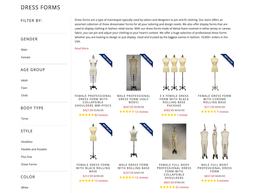
Source: mannequinmall.com
Finally, they have a great conversion-boosting element at the bottom of the page, a list of their most notable clients.
This social proof element is great for boosting trust and credibility, but it only works at the end of the page. At the top, it would have been seen as bragging.
Get Right to the Point
You also want to ensure that you demonstrate the value of the page as early on as possible.
Don’t expect visitors to keep scrolling and scrolling to get to the juicy bits, so to speak.
The sooner you are able to give them what they want, the higher the chances they will to stick around.
This tip often seems counterintuitive to some, as they believe that keeping a user longer on the page boosts both their SEO efforts and their conversion chances.
However, modern internet users are extensively jaded and have very little patience.
The sooner you give them the payoff or reward, the more they will appreciate you.
MarketBeat understands this well. Their dividend calculator is the first element you see on the page.
While there is plenty of other useful information available, like how to use it and how it was designed, that’s not what they lead with.
This saves visitors a lot of unnecessary scrolling.
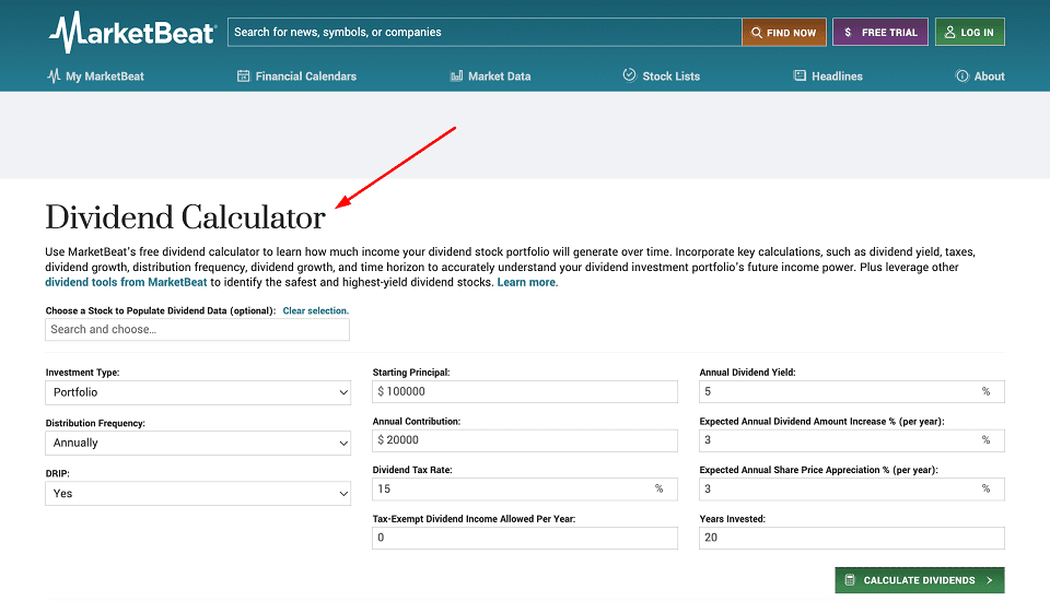
Source: marketbeat.com
Hook Them Early
Speaking of opening lines, other than leading with all the relevant information, you can also try using what copywriters call “the hook.”
It translates to including an enticing element as the first one of the page, one that is likely to spike interest and inspire further action.
What the hook is will naturally depend on your target audience and the search intent that has led them to you.
Your homepage can have a tagline that speaks directly to the pain points of your audience, for example. FE International has a brilliant one you can check out.
In just two sentences, they’ve managed to encapsulate the hopes (and fears) of their audience, and they’ve certainly hooked them to read more.
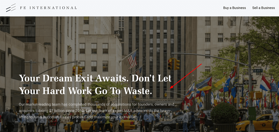
Source: feinternational.com
Or, you can hook them with a question they may not have expected.
ATH asks you right off the bat if you are getting enough protein.
Since you are in the market for a supplement already, the hook will work.
Highlight Your Expertise
Potential clients and customers will want to know that they can trust you and that you are good at what you do.
A simple yet highly effective approach you can use is listing your credentials and clearly highlighting your expertise.
You can list your awards or accreditations if your industry has them, reference media mentions or important clients, or even highlight case studies / customer testimonials.
Sometimes, all you have to do is state your credentials.
January AI mentions that their co-founder is the Chair of the Genetics Department and Stanford — they don’t need to say anything more to prove their product is built based on the latest scientific research.
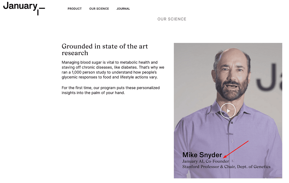
Source: january.ai
Make Your CTAs Pop
CTAs are some of the most important conversion-boosting elements.
After all, they are literally responsible for the actual conversion.
If you hide them, make them difficult to notice, or just make them bland and uninteresting, they won’t be nearly as effective.
Humans are highly visual creatures, and they want to have an enjoyable experience on your website.
Simply making your CTA pop can significantly improve your UX.
Preset Love has gone for a bright red, for example, and their page instantly seems more fun and approachable.
Had they made it gray or black, it would not be seeing nearly as many clicks.
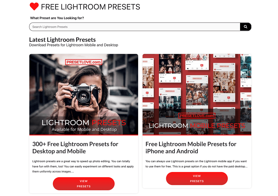
Source: presetlove.com
Don’t Be Afraid to Use Color
Speaking of color and making things pop, don’t shy away from using bright, bold, statement hues on your website.
It will make your entire presence more memorable and do a lot to improve user experience.
Of course, you’ll still need to keep the color story on-brand. Don’t go for something out of character, as it will have the opposite effect.
Here’s a simple example. Elegant Themes uses an extremely vibrant page that instantly makes you more interested in testing their themes out.
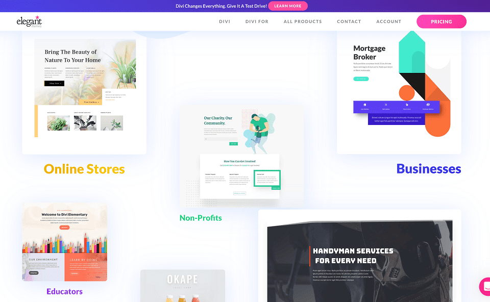
Source: elegantthemes.com
There is nothing dull about the page, and it does a great job of communicating competence as well as effectiveness.
Your goal is to find a color combination that has the same effect, in line with your own ethos.
Stand Out
Finally, remember that your audience has a practically unlimited set of choices.
They can go to someone else if you don’t do a good enough job of piquing their interest.
Make that your primary goal, and use all the above-mentioned elements as aids to achieve it.
We’ll leave you with a brilliant example of both design and copywriting that is I Done This.
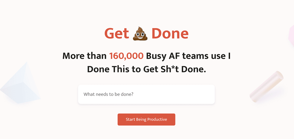
Source: idonethis.com (website no longer available as of 2025)
They may be unorthodox, but they’ve done everything right.
They hook you early, give you all the relevant information, and have a great color story.
Plus, their CTAs are clearly visible, and they are very upfront about the value you are getting.
Summary: High Converting Landing Pages Work
With the help of these eight elements, you can also benefit from high-converting landing pages.
Don’t forget to align them with your brand’s overarching marketing strategy and your audience’s preferences.
Disclaimer: The views and opinions stated in this post are that of the author, and Return On Now may or may not agree with any or all of the commentary.
Feature Image provided by the author under his or her own license.
This guest post brought to you courtesy of Return On Now, Professional Austin SEO and PPC Services Company.
Catherine Palmer
Latest posts by Catherine Palmer (see all)
- 6 Common CTA Mistakes That Are Killing Your Conversions - December 13, 2023
- 9 Types of Unique Content for Marketing (+Examples) - August 4, 2023
- 7 CTA Best Practices to Increase Conversions + 10 Great Examples - June 1, 2023