We can’t stress enough how important it is to have a responsive mobile website. For several years now, mobile search volumes have exceeded that of desktop. You simple need a mobile-friendly website, i.e. ease of use and fast access from smartphones, tables, and all device types.
As Google continues to evolve it’s AI functionality and algorithmic rankings, they’ve moved to mobile-first SERPs. Not only is this important for SEO, but you’ll see higher bounce rates and lower engagement overall if you fail to be mobile-friendly.
If you haven’t taken this seriously in the past, now is the time for action. Here are some important steps you can take to ensure your mobile-friendly website is suitable for both visitors and search engines.
Things You Can Do to Make Your Website Mobile-Friendly
Start By Auditing Your Existing Website
Before you decide whether or not you need a new or redesigned website, first determine if that’s even necessary.
If you have a fairly new website or design, you should expect that any good developer would have already made it mobile-friendly. It’s not like this is new – the “Mobilegeddon” update from Google came back in 2015. This has been common practice ever since that time.
Even if you used a premium template in WordPress or another content management system in the past 3-5 years, most of those should be delivered with a fully responsive feature set by default.
So your site may or may not be ideally optimized, but it could be very close if not. Maybe you just need a few tweaks to get it in order for the mobile user experience (UX).
One of the best ways to figure out whether or not you need improvements is to use the free Google Mobile-Friendly Test Tool. When in doubt, add your domain to the tool and let it tell you what you need to do.
ALWAYS Choose A Responsive Website Design
You really only have three options for mobile optimization when building a new website:
- Mobile-only URL: This is a separate website built 100% optimized for mobile, with its own URL such as “m.domain.com” or “www.domain.mobi.”
- Dynamic Serving Content: For this type of buildout, the same URL leads to a custom website version depending on which device is used to access the website.
- Responsive Design: Your website uses a single domain but it will serve up content in different orientations and formats dependent on the size of the screen rendering your website.
While any of these might work, responsive design is the best choice. Not only is it much easier to design in the first place, but you will find it far simpler to manage over time.
With responsive, you will ensure a consistent UX that serves up the same content across all device types. Plus, Google recommends it, which has made this the go-to approach for most digital marketers.
Of course, nothing is 100%. Depending on the needs of your mobile visitors, you may want to consider one of the other two options. But stick to responsive unless there is a very important business need to proceed otherwise.
It’s not hard at all to move to responsive if you aren’t already there. You can find literally millions of responsive website templates across the internet.
Some may cost money, but in the long run, the old adage of “you get what you pay for” is relevant in this case. We’ve always opted for premium templates for our own web properties to ensure a rich feature set and premium support from the developers.
Opt for Simpler Designs
The bigger and more complicated your design gets, the more risk you will be introducing with respect to performance. Simple web design will almost always outperform these “pie in the sky,” overly creative website approaches.
Of course, you don’t want to create a drab and boring website. That won’t keep visitors coming back.
Focus on reducing clutter and unneeded scripts. Focus on what is most important. In fact, many users prefer minimalist designs, which just so happen to require less files to load when the site renders in a browser.
By keeping the code simple, you’ll also be helping search engine crawlers more easily index your content. This is a direct impact on your SEO progress!
And of course, mobile visitors will be able to focus on the messaging instead of a bunch of fancy bells and whistles. If they fail to get your message, your website isn’t really working as intended anyway.
Never Forget Compression For Performance Purposes
We often audit websites that are very slow loading, and can diagnose the reasons why this is happening. In nearly every case, it comes down to things like huge images and more complex coding on the website.
Compression allows you to shrink the sizes on your images, which then in turn enables them to load much faster. You can also compress the code itself to shave anywhere from milliseconds to actual seconds off your page loading time.
Desktop users wait approximately seven seconds for a page to load before jumping ship. Mobile visitors wait closer to three seconds. This hurts your bounce rate, which can negatively impact SEO.
This is how important performance is. Take it seriously and start with compression.
Employ Media Queries For Optimum UX
Have you heard of media queries with respect to websites? They’re pretty simple – with media queries, you can ask what size a device is and then adjust the website serving up based on its CSS codebase.
Be sure your configuration includes as many device sizes / dimensions as possible. If you stick to only the most common formats, you risk having a poor UX on some or many of the devices users might be employing to surf the web and visit your domain.
Use Percentages When Setting Screen Width
Even within the same mobile brands (Apple, Samsung, etc.), smartphones have nonuniform screen sizes.
One of the worst things about accessing nonresponsive websites on a phone is the need to scroll sideways to view all of the content.
By using percentage to determine width, you will be massively improving what visitors have to deal with on your domain. When your website elements adjust to the screen as opposed to a static value, you’ll ensure everything fits properly on all screen sizes from the start.
Include Alt Text Tags For All Images
Alt Texts are one of the most important on-page elements to optimize for search engines. they’re also crucial to your text-to-voice functionality for vision impaired users. You should be generating these upon image upload as standard practice.
These aren’t the only benefits of Image Alt Texts. On some mobile devices, images are blocked altogether for loading speed improvement and reduced data consumption, particularly for visits on LTE or 5G connections.
So there’s no other way to know what the image would have been if you omit the Alt Text. And equally important, they are also useful for replacing clickable images that lead to another webpage but fail to load on mobile.
Enable Accelerated Mobile Pages (AMP)
Accelerated Mobile Pages was created by an industry consortium led by Google. The AMP concept was built to make mobile browsing smoother and faster.
When AMP is enabled for a website, the content management system strips away all data-heavy elements and replaces it with a compressed HTML version focused on the written content itself. Without all the extraneous images and scripts to load, your website can come up on mobile devices much, much faster.
AMP works best for content that doesn’t require all of the additional stuff to be effective, such as press releases and blog posts.
And it’s not terribly difficult to deploy if you have one of the top CMS’s. WordPress, for example, has a number of options that you can add to the website rather quickly if you want AMP for your own domain.
Size Buttons For Easy, Error-Free Clicking
As we all know, it is much more difficult to click a button or link with a fingertip than it would be with a standard mouse. After all, your finger has more surface area as compared to a virtual arrow.
One of the mobile friendly issues that Google will call out in their free test is “Clickable Elements Too Close Together.” This means your links and buttons aren’t sufficiently spaced for a typical user to click the right element without frequently clicking the wrong thing.
Space out your buttons, and make them as big as reasonably possible for your responsive / mobile website. This will eliminate the stray clicking problem.
Standard industry guidance these days of to aim for 42-to-72 pixels for all buttons on your website. With this size of button and sufficient space between them, your users will be thankful for the smart UX decision.
Be Smart About Where You Place Your Buttons
Button placement isn’t solely about keeping them spaced apart. There are areas of the screen where you should avoid putting them, too.
Many people use thumbs to interact with websites on a touch screen. For these visitors, you will frustrate them if you put buttons in the very corners of the screen where they’ll struggle to reach them.
Basically, as your screen size grows, users have more limited reach into the screen for tapping. Always take this into account when deciding where to place clickable elements as a whole.
Just Say No To Pop-Ups
Let’s face it…we all hate pop-ups. They’re annoying, intrusive, and disruptive to the visitor.
On smaller screens, the negative impression from pop-ups is even worse. Not only do they outright block access to the content, but the close button tends to be infuriatingly small! Especially for clicking with a finger (like small buttons, just don’t!).
And the message box itself can even be distorted if it isn’t properly optimized for mobile, too.
Just don’t do it. Particularly for mobile visitors who have a low tolerance for poor UX.
I get it…a lot of web marketers will push back on this recommendation because “leads.” Your business might live or die on the volume of leads you can pull down from website traffic. If that’s the case, then please, PLEASE do everything you can to make them a unobtrusive as possible.
First, never serve a pop-up the moment a visitor arrives. Most mobile users will just hit the “Back” button and leave forever (I know I will every single time). The only exceptions here are for when you need age verification (e.g. on a wine or distillery website) or if you need to confirm cookie collection to comply with regulatory compliance laws like GDPR.
Give people a little time to read the page or post first. Maybe set it to pop-up when they hit the bottom of the page, or when they try to leave the website. This is far less annoying and intrusive to the visitor.
It would be less of an issue for you to set a pop-up to show when a user clicks a specific link. If they’re already clicking a link, they are expecting to see something different or go to a new URL.
Always Ask As Little As Possible On Forms
It’s common knowledge in the lead generation space that longer forms are conversion killers. For every field you add to the form, you’ll see your completion percentage decrese.
Privacy has become a huge concern. Robo-dialers and spammers/scammers have abused the data they get their hands on ad nauseum. No one wants to share more than they absolutely have to.
Not to mention, it’s just a pain in the backside to fill out forms on mobile devices. Maybe it’s hard to type, Maybe autocorrect likes to change “Street” to “sheet.” The possibilities of something disrupting the conversion process are nearly limitless on mobile.
If you care about leads, ask as little as possible for you to follow up and pursue a sale. Email is enough for newsletters and blog alerts. Mailing address only matters if they’re signing up to have a physical document or product sent to them. Phone number is a touchy subject, so think long and hard about what you will do with that data and tell them.
This matters on desktop / laptop. But it matters tenfold on mobile. Keep your forms short and concise.
Whenever You Can, Turn Off Autocorrect
I mentioned autocorrect above, and it’s a real issue with forms. Interested web visitors may have a low tolerance for anything that slows them down.
Not all form builders have the ability to turn off autocorrect. But if yours includes it, use it.
If your form builder doesn’t have it, consider engaging a developer to add that feature. You may be able to significantly improve your conversion completion rate, and in turn, your overall revenue from website leads.
Write For The Short Attention Spans Of The Mobile Web
Think about a time you visited a website on your smartphone, only to be presented with what looked like never-ending blocks of text content. Ugh…did you choose to read it, or bail on the page altogether?
If you’re like most mobile visitors, you bounced and never had a second thought about it.
On mobile phones, even moderate lengths of content can look like books. These users want to quickly scan and scroll through the content, not commit 15-20 minutes to unwrapping your life story (unless it’s on a blog focused on that topic).
When writing for mobile, always follow these tips:
- Break up the content into subheads for ease of scanning by new visitors
- Use bullet points, ordered lists, and blocks of text that can reflow depending on screen size for better UX
- Always write shorter sentences, and very short paragraphs – like 1-2 sentences max
- Avoid complex language and jargon when you can, unless it’s standard speak for your niche
- Never write in passive tense! This isn’t poetry – be direct
We work hard on this very blog to follow these directions, including hands-on editing of content received as guest posts. If you value mobile traffic (and you should), you should build this into your standard writing and editing practices for your own domain.
Pick the Right Fonts
Even on larger screens, many people find it tough to read small text (especially older visitors).
When you reduce that to tiny phone screen, the problem doubles. Use larger fonts so people don’t have to zoom in. Because many of them may not care to even try.
Also pick a good typeface which is easy on the eyes. Many webmasters pick serif fonts since they’re pretty easy to tell apart. Others like more straightforward fonts like Arial, without all the fancy lines and strokes.
I, personally, avoid things like Verdana, Times New Roman, and Sans Serif. Those can be tough to read for older visitors because they don’t contrast well with many backgrounds. This problem is magnified on tiny screens, so choose wisely.
Make Sure Your Website Hosting Is Fast and Reliable
If you pick a cheap hosting plan for your website, you should expect subpar performance. Period.
We already covered how mobile users won’t wait for slow websites to load.
Run a speed test on your domain, and be sure it reports on mobile as well as desktop. This will tell you what is slowing down the load time. If web hosting shows as having even a medium impact on performance, upgrade your plan stat.
Good website hosts will also offer quality support and more features than cheap hosting (e.g. automatic nightly backups, automatic CMS upgrades, etc.). You might pay more, but you’ll also receive more in return.
Run Mobile-Friendly Test After All Changes
Even if you ran your domain through Google’s free testing tool in advance, do it again after you fix whatever it recommended.
This is akin to running an SEO audit AFTER you make major changes to content and on-page. You will want to compare before and after to ensure you actually fixed the site and didn’t inadvertently mess up something else.
You’ll also want to test the website on as many devices, operating systems, and browsers as possible.
And of course, you should schedule regular check-ins every 90-or-180 days to monitor any changes that happen via core updates or growth in database size. These can impact performance down the road.
Conclusion: Settle For No Less Than Mobile-Friendly
If you want to have a healthy influx of mobile traffic, a mobile-friendly website is a requirement, not an option.
Make sure it looks right and works properly on smartphones and tablets, at least on par with the desktop UX. And responsive design is by far the easiest and best way to make this happen.
Be sure to take all of these tips into account while doing so. Once your website is fully mobile-friendly, you’ll be able to satisfy and impress visitors on any platform and any browser.
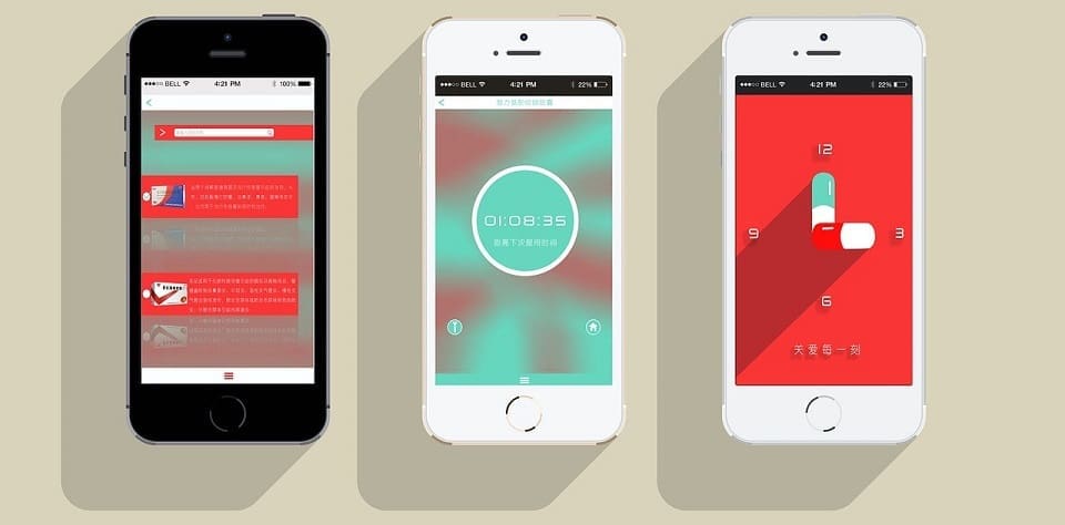
Feature Image Credit: CC 0; Public Domain. Feature image sourced from pixabay.com.
Disclaimer: The views and opinions stated in this post are that of the author, and Return On Now may or may not agree with any or all of the commentary.
This guest post brought to you courtesy of Return On Now, Professional Austin SEO and PPC Services Company.
Tommy Landry
Latest posts by Tommy Landry (see all)
- The AI Marketing Signal Brief: AI Marketing Governance Is Becoming a Permissions Problem - July 20, 2026
- The AI Marketing Signal Brief: AI Search and AI Agents Are Forcing Governance Into the Workflow Layer - July 6, 2026
- The AI Marketing Signal Brief: AI Search Reporting Is Entering the Revenue System - June 19, 2026