According to statistical data, there are more than 25,000 SaaS companies operating globally in 2022. Moreover, these organizations cater to a combined total of approximately 14 billion users.
And last but not least, total SaaS market revenue is expected to reach (and possibly surpass) the $208 billion mark by the end of this year.
So, looking at the data, it’s safe to say that new brands trying to break into the industry must prepare themselves for a lot of competition.
And not just that. They have to accept that the current median conversion rate in the SaaS industry falls at a mere 3%, leaving much room for improvement.
Naturally, there are many ways to reach success when running a SaaS business.
Even in a competitive market.
However, in addition to improving products and choosing the right marketing strategies), the two best ways to boost SaaS conversions are:
- Pick a SaaS business model that fits your brand’s goals and has a chance of appealing to your target audience
- Optimize your website to boost its ability to drive conversions
So, if you’ve done the first thing and want your website to drive new business, focus on the one page where conversions usually happen: the pricing page.
What Makes Up A High-Converting SaaS Pricing Page?
This post will outline how to create a high-converting SaaS pricing page.
With this in order, you can join the top performers in your industry and cement your business venture’s future success.
Customer-Focused Value Propositions
Your customer-focused value proposition is one of the most important components when designing a SaaS pricing page.
But why is this the case?
After all, if you look at the standard SaaS pricing page, you won’t often see a sales proposition at all.
Check out Figma for an example of what businesses usually do:
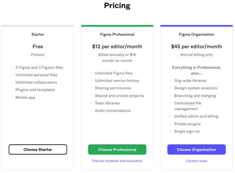
Source: figma.com
Simply put, you need a value proposition on your SaaS pricing page.
This page is one of the last stops on your audience’s journey towards a conversion.
So, if you allow potential buyers to pass by that stop without reminding them what they stand to gain by investing in your product, you risk losing them as a customer.
Of course, not just any value proposition will do.
To maximize impact, it will have to address your audience’s pain points and how your offer can solve those frustrations.
In other words, the best value proposition will focus on customer rewards.
To see an excellent example that nails the sales proposition, check out Headspace’s approach below.
The brand uses the pricing page to deliver a compelling call to action for users to “be kind to [their] minds.”
At the same time, it manages to depict the exact benefit for users downloading the app, which include a sense of calm, self-love, and relaxation.
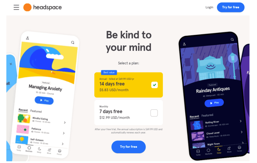
Source: headspace.com
Annual Payment Incentives
A lot of SaaS decision makers shy away from encouraging annual payments, thinking it may suppress conversion rates.
After all, you should try to minimize customer risk when convincing people to invest in your products, right? Technically, yes.
However, the truth is that one of the absolute best ways to guarantee customer loyalty is to maximize the time new users will be interacting with your software.
By urging users to opt for an annual subscription with visuals and UI elements, you can generate benefits for both you and your customers:
- Customers save money
- You get a chance to combat the average 6% user churn rate, boost customer lifetime value, and enjoy a more predictable cash flow
With this in mind, it’s not a bad idea for you to play around with annual payment incentives on your SaaS pricing page.
You could do something similar to Crowdcast, a brand that uses a sleek slider to attract user attention to the 30% savings that come with the annual plan.
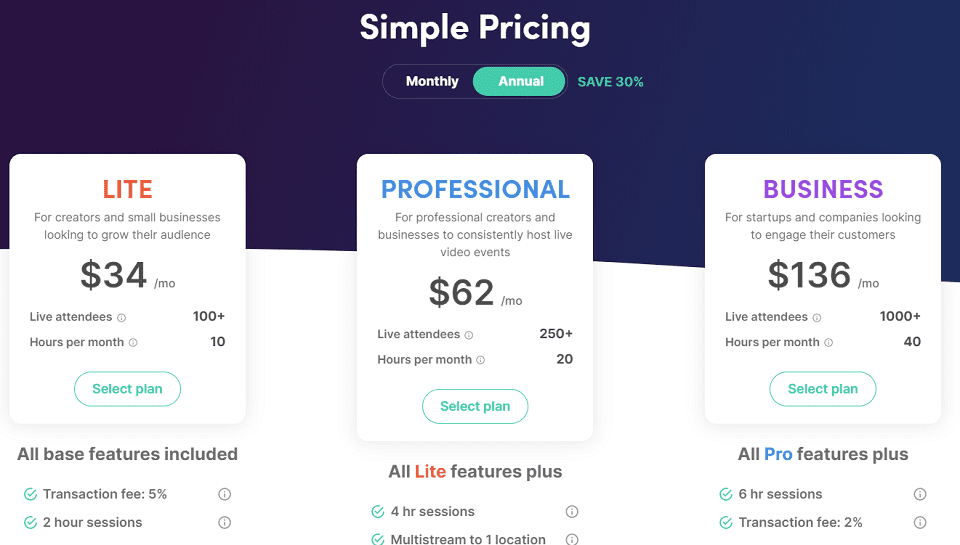
Source: crowdcast.io
The Main Benefit of Each Subscription Plan
The consumer decision journey is never a linear process.
In fact, according to McKinsey, the buyer’s journey is a closed loop in which every current product or service experience impacts future buying decisions.
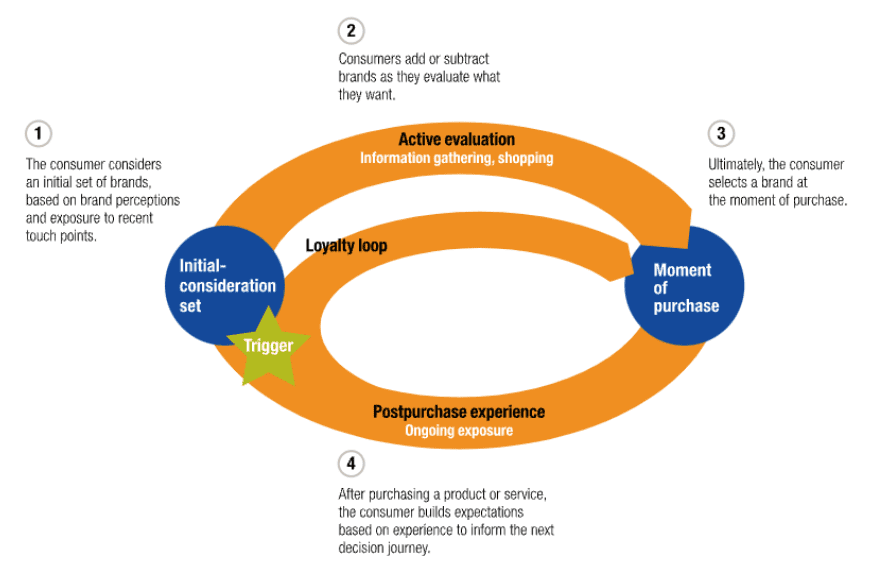
Source: mckinsey.com
With this in mind, it becomes clear that SaaS brands have to ensure that potential subscribers pick the service plan that will do the best job of solving their pain points.
Fortunately, this is relatively easy to do by adopting the right approach to how you present various subscription plans on SaaS pricing pages.
Generally, the best practice is to use customer-oriented copy that successfully highlights the benefits of each option and makes it easy for new customers to choose.
The on-page copy doesn’t have to be long or feature-oriented.
In fact, it has a much higher chance of leading to the right purchase decision if it’s simple, direct, and easily understandable.
An excellent example of a brand successfully communicating the different benefits of subscription plans comes from Affinda.
By pointing out the precise best-use scenario for each package, the brand actively helps potential customers make a solid choice and contributes to a better buying experience.
Together, these two attributes will encourage customer loyalty in the long term.
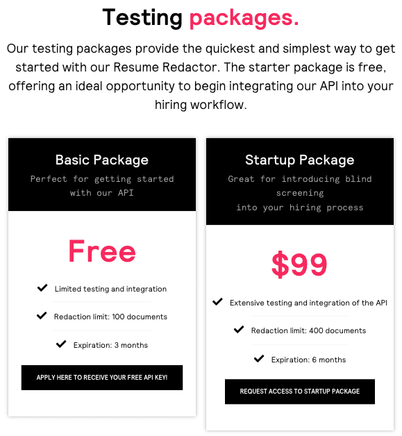
Source: affinda.com
The brand Notion, on the other hand, uses the pricing page to speak to different buyer personas directly.
So, the Personal plan invites people who want to organize “every corner of [their] life,” while the Team option is meant to help entrepreneurs “collaborate with [their] entire team in one place.”
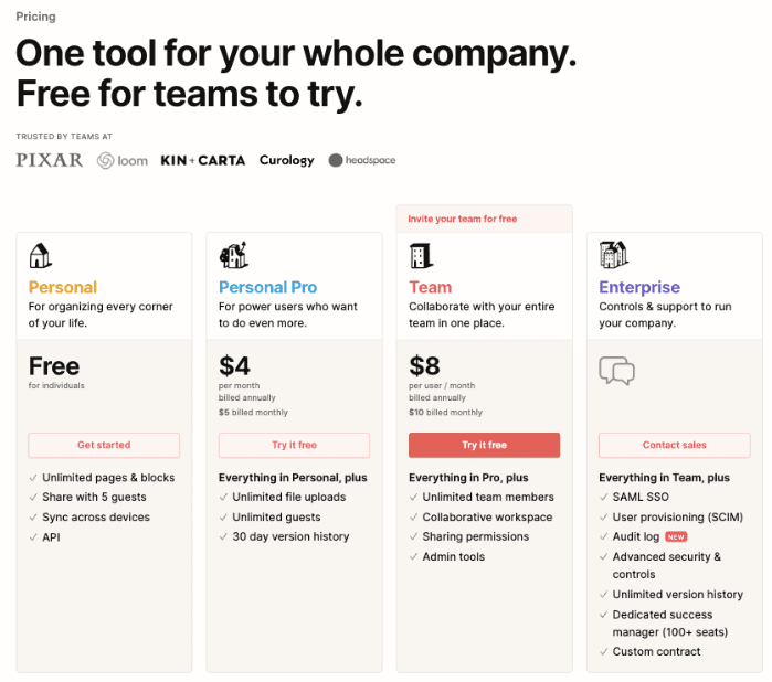
Source: notion.so
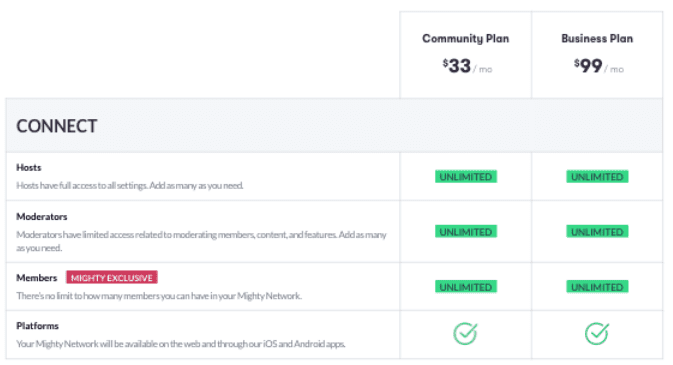
A Simplified Comparison Matrix
As you look for ways to optimize your SaaS pricing pages for conversions, your initial instinct may be to provide as much detail about each option as possible.
However, if you choose to act on this instinct, you’ll be making the wrong choice.
The best way to encourage conversions (on any page) is to present your users with a clear path. Deliver your value proposition, sum up the benefits they will gain by converting, and deliver a compelling CTA.
Instead of allowing details and technicalities to overshadow these crucial page elements, choose to go in a more simplified direction.
Only address the essential differences in your comparison charts.
Then, create an additional section of your SaaS pricing page where you can make in-depth comparisons and inform potential buyers about the specific features included in each subscription plan.
This is what Mighty Networks does on its website.
The strategy works splendidly, and not just because it prevents web visitors from becoming overwhelmed when choosing an option to invest in.
Another key reason it works is because it doesn’t detract the attention of those users who already know what plan they need, encouraging them, instead, to convert.
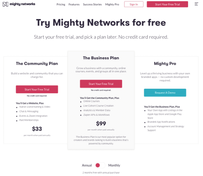
Source: mightynetworks.com
In-Person Contact Options
If your goal is to achieve impressive conversion rates in 2022 and beyond, you have to take a more personal approach to sales.
Today’s buyers consider personalization to be a basic expectation.
In fact, research from Twilio Segment shows that getting personalization right instantly boosts customer loyalty as well.
And, it turns out that adding a touch of personalization to your SaaS pricing pages doesn’t have to be a challenging task.
By doing something as elementary as including in-person contact options (like chat and telephone) on these web pages, you can effectively encourage users to get in touch with your sales team.
That way, you ensure that they get the answers they’re after.
Plus, you prevent them from navigating away from your pricing pages and getting one step further from converting.
And the great thing is that adopting this strategy to boost conversions shouldn’t be too complicated.
For instance, a quick look at the Loom pricing page shows that the brand’s most expensive subscription plan comes with a “Let’s Talk” CTA that allows the company to provide potential buyers with an offer tailored specifically to their needs.
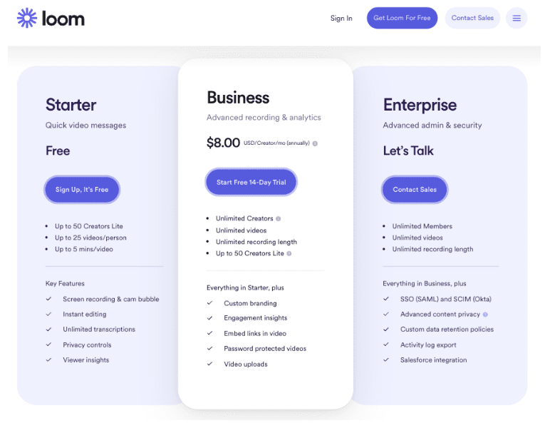
Source: loom.com
A Clear Breakdown of Your Core Service
The stages of the traditional buyer’s journey suggests that the website visitors viewing your product and pricing pages already have a solid understanding of your software products.
Nonetheless, it’s critical to understand that there will be instances when the people looking at these online assets need a bit more information regarding the benefits of your solutions.
So, don’t hesitate to enrich your SaaS pricing page with a clear and simple breakdown of your core service.
This will ensure your audience knows what they’ll get by converting.
And equally notably, it will help you better manage customer expectations.
If you need inspiration for how to do this, check out the Scott’s Cheap Flights Elite product pricing page.
It includes an informative how-it-works section, which describes the customer experience in three simple steps and ensures that buyers know precisely what they will get by signing up for the service.
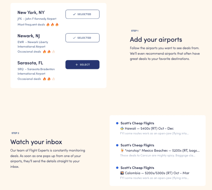
Source: scottscheapflights.com
Social Proof
If you’re looking to boost conversions on your SaaS pricing page, you should consider adding at least one social proof element.
Research from G2 shows that software buyers are more and more critical regarding the products and services they invest in.
In fact, as many as 86% of SaaS buyers use peer review sites before choosing a software solution.
Moreover, 60% of people say that basing their purchasing decisions on social proof makes them more confident about having chosen a service provider that’s trustworthy and reliable.
So, if you’re exploring the various elements that make up the anatomy of a high-converting SaaS pricing page, make sure that you consider including testimonials, reviews, customer stories, case studies, and UGC on your website.
Naturally, there are multiple ways you can do this.
Branch, for instance, employs social proof in the form of customer logos to show how its software solution contributes to the success of famous brands like Instacart, Airbnb, Strava, and Reddit.
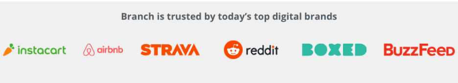
Source: branch.io
And Pleo goes a step further by combining client logos with testimonials from happy customers, statistical data about the number of its users, and third-party trust badges that show its 5-star ratings on websites like Trustpilot and Capterra.
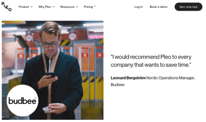
Source: pleo.io
An Anchor Price
Do you want to use consumer psychology to your advantage when designing a pricing page for your SaaS business?
If that’s the case, it’s not a bad idea to acquaint yourself with the strategy of price anchoring.
Essentially, price anchoring refers to the practice of creating a reference price that determines the value of your products.
Once your target audience has a notion of how much your products are worth, you can impact their buying decisions by allowing them to get your products for less than the anchor price or presenting them with alternate offers that they’ll perceive as cheap or a better value for money.
GetSafe, for example, implements this strategy by offering users a “4th of July Special,” which clearly shows the original (anchor) price to convince potential buyers that they’re saving money and encourage them to convert.
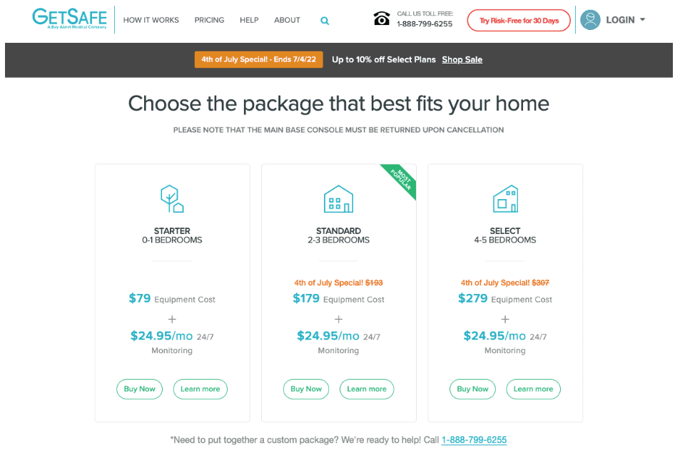
Source: getsafe.com
Frequently Asked Questions
Finally, as you consider the elements that make up a high-converting SaaS pricing page, don’t forget that some potential customers will need additional information before they’re ready to click the buy button.
So, explore ways to address their most prominent questions and doubts, and instill them with a sense of security.
Something as simple as an FAQ section at the bottom of your pricing page can effectively help you do this.
Of course, when putting together an element such as this, don’t fall into the trap of wasting precious space on providing irrelevant or repetitive information.
Instead, use actual questions your sales and support teams have received from your users, especially those about conversion obstacles.
Do your best to give informative answers that illustrate your brand’s credibility.
Take a look at the Sendbird pricing page. You’ll see that the brand’s “Commonly asked questions” section addresses critical user inquiries.
In this way, they can ensure that every single buyer has a complete understanding of what to expect from their chosen subscription plan before deciding to convert.
By providing direct and transparent answers, the brand isn’t just guiding its audience towards making a purchase.
Much more importantly, it’s ensuring that potential customers choose the plan that fits their needs the best.
This choice will inevitably lead to a better customer experience and positively impact customer loyalty.
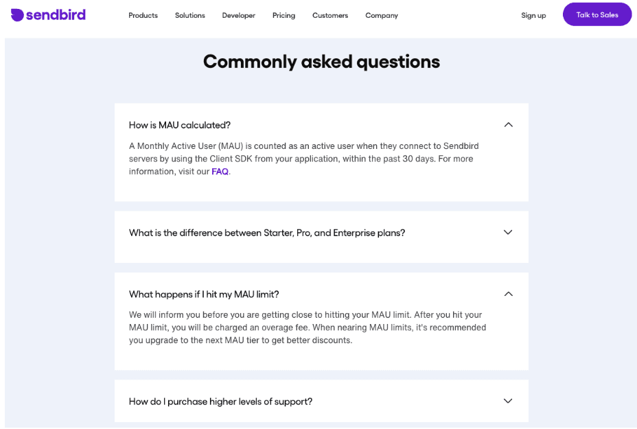
Source: sendbird.com (website no longer live as of late 2025)
Conclusion
As you can see, there are many elements you can include on your company’s SaaS pricing page.
To ensure that this crucial online asset actually converts, you need to consider your audience’s needs before adding or subtracting anything from the web page.
If possible, look at your metrics and see how well your pricing page converts right now.
Then, try adding the above-mentioned elements one by one so that you can effectively measure their positive (or negative) impact on your site’s conversion rates.
That way, you won’t just be enjoying improved site performance and more revenue.
You’ll also start forming better ideas about what conversion-driving elements work for your target audience, helping you optimize the rest of your website and marketing campaigns.
Feature Image taken as screenshot directly from the vendor pricing page.
Disclaimer: The views and opinions stated in this post are that of the author, and Return On Now may or may not agree with any or all of the commentary.
Updated December 2, 2025
Travis Jamison
Latest posts by Travis Jamison (see all)
- Ecommerce Copywriting Tactics: How Language Differentiates Your Brand - July 21, 2023
- 6 Simple Ways to Differentiate Your Brand on Social Media - December 6, 2022
- Anatomy of a High-Converting SaaS Pricing Page - August 16, 2022