Website bounce rate is one of the most controversial indicators when it comes to evaluating digital marketing and web performance.
Let’s see how Google counts the bounce rate. It calculates the percentage of single-page views compared to the total number of visits.
So, when a person visits your website, looks through just one page, and clicks on the return button, it’s considered a bounce in the analytics report.
The reasons for a bounce may lie in the information you place on the page. If users get what they need, why should they open other pages on the website?
For instance, they can dial the number or order a product without going anywhere else on the site. In this scenario, the user fulfilled their intention and didn’t leave you in favor of some other source, which is great.
But in most cases, the high bounce rate reflects issues in user experience. If it’s poor, no one will stay on your site. Let alone convert.
In this post, we’ll go over what you can do to improve your website bounce rate.
Three Key Points to Decrease Your Website Bounce Rate
To best manage your website bounce rate, you’ll need to improve things like mobile-friendliness, messaging, and architecture. Let’s review the first one now:
Give Mobile Friendliness Due Attention
According to the Digital 2020 research, we spend more than half of our online time on phones (50.1%). And search engines were quick to react to the increase in mobile traffic.
Google was the first one to pay attention to mobile-friendliness and introduced the Mobile-First algorithm.
What does this algorithm imply for web pages? That a mobile-friendly website would appear higher in search results.
What does a mobile-friendly website imply? Ideally, it should have a fast page load speed and decent UX/UI, making it simple to navigate the website from a smartphone.
If a user attempts to open your website from their mobile browser, and it takes too much time to load, they’ll close it and continue browsing other options.
The same thing will happen if the used design isn’t intuitive nor convenient. This results in bounce and lost leads.
However, there are a lot of websites unoptimized for mobile. What is preventing website owners from taking this step?
First, mobile optimization may be a costly investment. Second, it’s challenging from a technical point of view.
Despite this, the importance of mobile optimization is unquestionable. Do you still doubt the cost-effectiveness of this move? Look at the following benefits:
- Better positions in search results
- More traffic
- Increased website conversions
- Boost in CTR (click-through rate)
- Enhanced behavioral characteristics
All these add up to increased revenues, so the optimization costs will quickly pay for themselves.
How can you tell if the website is mobile-friendly? Use the Google Mobile-Friendly Test tool.
Look at the Mailchimp website analysis. As you can see, it caters to smartphone users’ demands.
There are additional features to track your mobile usability, learn more about mobile-friendliness, and ask questions to the group.
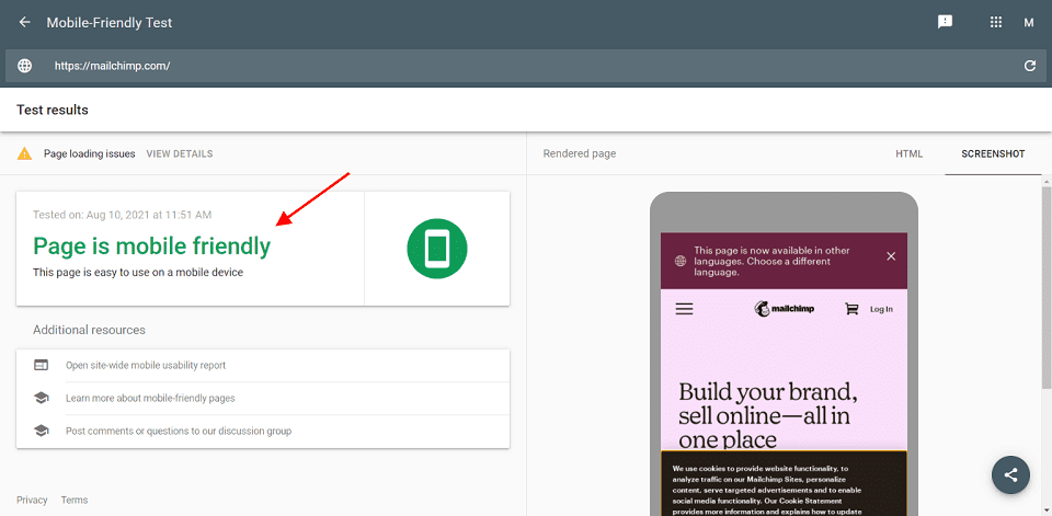
Screenshot taken on the Google Mobile-Friendly Test tool
We figured out that mobile optimization is essential. What are the solution options? One of them is to convert your website to a progressive web application.
As a result, you’ll have the same site available for crawling by search engines, but it will look and work like a mobile app, like in these Magento 2 PWA examples.
Speak About the Product’s Value
How can you create a flawless product page? If you saturate your site with too much information, the visitors may become overwhelmed. On the other hand, if the details aren’t sufficient, the prospects won’t make informed decisions.
Take some time to discover content optimization options. If the reason for low sales isn’t your artificially high prices, potential customers may refuse to place orders because your product pages lack information on the product’s value.
To illustrate my point, I provide an example of Replay jeans. The company outlines basic features: “11.5 oz original baby blue power stretch denim” or “regular waist and slightly tapered leg.” But that’s what many brands do.
Replay decided to highlight other benefits. The main advantage of their jeans is their environmental friendliness. They emphasize that these jeans diminish ecological impact: “reduce by 85% the water consumption.”
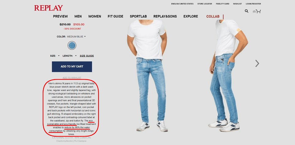
Screenshot taken on the official Replay website
Organize Product Information in a Logical Manner
Users will bounce and close your site if the navigation is unclear. How can customers know exactly where to click?
Your website navigation menus and calls to action should lead your potential client to other pages and purchases.
As we can see from the Statista poll results below, about 60% of respondents give prominence to the website usability.
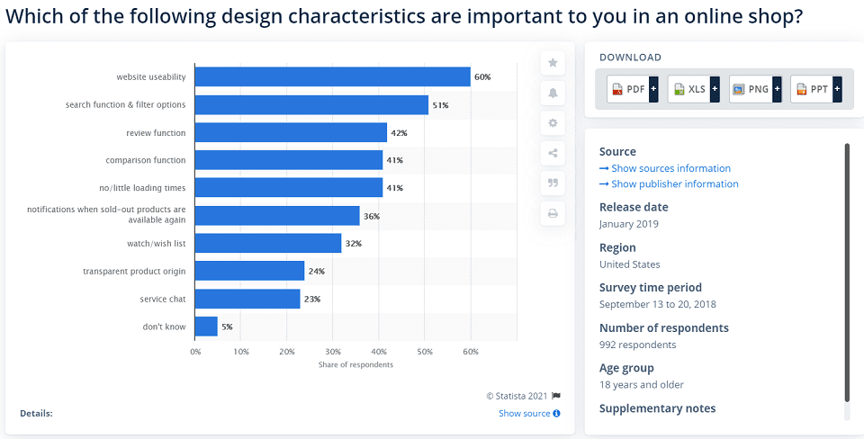
Image credit: Statista
How can you provide user-friendly content? Simplify your navigation to the maximum possible.
For example, break the text into sections with subheadings and build bulleted lists and paragraphs. Getting through a wall of solid text is out of the question.
On the Spreadshirt site, you can observe information equally conveniently from a desktop and mobile phone. In addition, the bulleted list allows readers to skim through the product characteristics.
Visitors can click on the “+” icon and select the hoodie’s size, comparing it with the measurements of the hoodie they wear.
When you visit the page from a mobile phone, you don’t see the description at once but the category title. It’s more convenient because you don’t have to scroll the page to get to the needed section.
Instead, you can press the same “+” icon to expand the section you’d like to read.
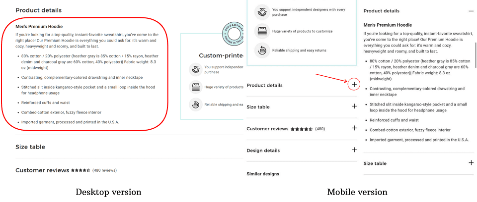
Screenshot taken on the official Spreadshirt website
Conclusion: Control Website Bounce Rate
Measuring the bounce rate provides valuable information about your digital marketing, relevancy, and user experience.
What happens if you neglect the high website bounce rate? It harms SEO and other metrics such as conversions.
Note that it applies to the situation of the poor website experience. A big number of bounces doesn’t always have a negative connotation (for example, for single-page websites).
Cross-reference your bounce rate with other metrics like time spent on your site to acquire even more specific information. It will highlight the website’s weak points you need to address.
Furthermore, make sure to provide effective UX design techniques, such as:
- Removing distracting elements from your site
- Giving customers simple navigation alternatives
- Optimizing the site for mobile users
And that’s how you’ll increase customer engagement, sales, and reduce the bounce rate.
Feature Image Credit: CC0, via Unsplash
Disclaimer: The views and opinions stated in this post are that of the author, and Return On Now may or may not agree with any or all of the commentary.
This guest post brought to you courtesy of Return On Now, Professional Austin SEO and PPC Services Company.
Kate Parish
Latest posts by Kate Parish (see all)
- Three Ways to Reduce Your Website Bounce Rate - December 14, 2021


