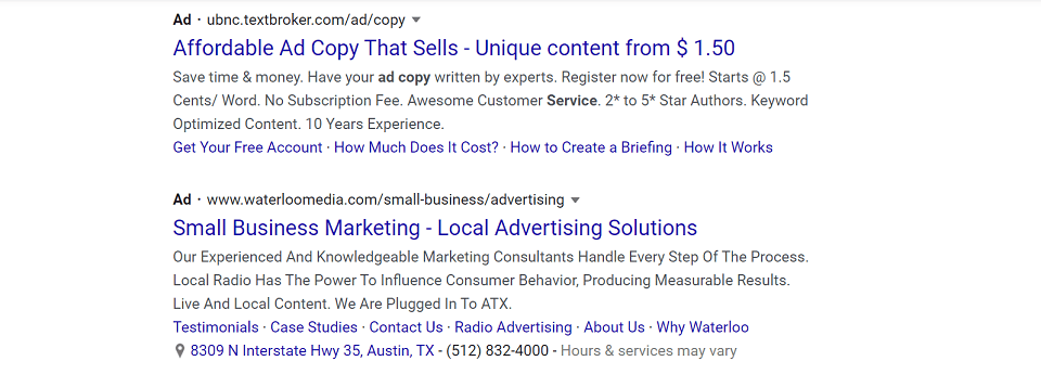
Many businesses pursue business leads via a range of mediums, such as pay-per-click (PPC), search engine optimization (SEO), and social media marketing.
If you’re using PPC, the chances are that you are directing visitors to your landing pages. The better you’re able to pitch them the offer and get them to convert, the more effective your overall ROI will be.
But what exactly is a landing page anyway?
A landing page is a web page that captures visitor’s details through a lead-capture form. The primary role of this page is to convert visitors into leads.
Well-built landing pages target particular audiences, such as visitors who receive direct mail postcards that promote your services or products, or traffic from digital advertising campaigns promoting certain offers.
This post will outline some important landing page design tips that will help boost your business leads and conversions on those pages.
Set Goals Before Creating A Landing Page
Before you start any campaign, you need to know why you’re creating it. Having clear goals is one of the critical foundations for any successful landing page.
You should have a clear vision of what is expected to happen once you launch the campaign.
It can be a challenge to define goals and measure success, so here are four guiding questions that will help you to set your goals.
1. What Are The Business Objectives?
Before anything else, start with a big picture.
- What is it that your business wants to achieve?
- Do you want more clients? And how do these customers look?
- What are the characteristics of the buyers?
- What are the reasons for starting the campaign? Perhaps, it’s for brand awareness or boosting sales.
2. How Will The Landing Page Incorporate Your Objectives?
Once you are done with your business objectives, the next target should be the specific campaign.
How does your landing page fit your overall business objective?
For instance, if you want more email subscribers, you must have a strong hook for people to sign up.
Alternatively, if you’re after brand awareness, you need robust click through rates from the ads to the landing page.
3. What Is Your Key Performance Indicator (KPI)?
Now that you have the goals, it’s time to use data to determine the success modalities.
For instance, if you intend to sell more of commodity X, the KPI for this particular campaign will increased volume of leads sent to your sales representatives.
This means you need to be specific with where the sales will happen that’s either online or offline.
4. Which Metrics Will You Monitor?
Once you’ve decided on your KPI, the next step is to determine the metrics that will indicate success.
If you’re aiming for increased sales, determine the number of deals you hope to close by the end of the campaign.
And if your goal is more email subscribers, specify the number of new email addresses you want collected before the end of the campaign.
Create An Attractive Call To Action
Digital marketing for ecommerce is most effective when partnered with a compelling call to action (CTA).
The primary role of your CTA is to set expectations and make an offer, so you can win that hard-earned click and conversion itself.
With a very specific CTA, you’ll see better results across the board.
Below are valuable strategies to help you to create more impactful CTAs.
Start Your CTA with A Strong Command Verb
You’ll do better converting any CTA if it is clear and concise.
It is important to make the use of limited space, perhaps on a button, so work hard to get this part right.
Get straight to the point. Let your visitors know exactly what you want them to do.
Start your CTA with “buy,” “order,” “shop”, “subscribe,” “download,” “find out how…,” or “fill out a form for…”.
Use Emotion or Enthusiasm Provoking Word
In order to get a favorable response to your CTAs, use language that is emotional and enthusiastic.
Offers can really move the needle, something like “shop today and get 60% off.” Everyone like a discount or cash offer, particularly consumers / home buyers.
Provide a Reason Why the Audience Should Take the Action
If you want to make your CTAs really shine, always let the prospect know what’s in it for them up front.
For example, will it help them lose weight? Make more money? Get a better job?
Each of these is what we call a unique selling point (USP). Good USPs will increase click thrus as well as conversions if you select something compelling to your target audience and their needs.
Involve FOMO
Take advantage of the fear of missing out (FOMO), referred to in some circles as urgency.
Humans are more likely to take quick action if they think they’ll miss an opportunity that’s short-lived.
Some examples of using urgency / FOMO: “Buy today,” “Sale ends on Saturday,” or “buy now before we run out of stock.”
Know the Preferred Platforms / Devices for Your target Audience
Your CTA should consider the devices your audience uses. Tablet and desktop should have starkly different user experiences as compared to mobile phone visitors.
Keep The Main Headline Short And Simple
Your audience will always notice the headline on your landing page before perusing the rest of the content. Because of this, keep your primary headline concise and straightforward.
This applies to all efforts to sell or convert visitors online, and here are a few more tips to get your headline just right:
Be Clear and Specific
An eye-catching landing page should not be too wordy. Keep it straightforward and with one intention: Getting visitors to read the rest of the page.
It should completely communicate the purpose of the campaign and what you are trying to tell them.
Focus On One Key Benefit
A product or service may have many benefits. Your headlines should select only one and focus there for the landing page.
Make sure it’s a strong, high level benefit, so it can serve as an umbrella across other products and/or services.
Use Numbers
Numbers are one way of keeping the headline short. They also keep the headline catchy and detailed.
Write Persuasive Body Text
All good marketing campaigns are only as effective as the body copy is persuasive.
A lot of CRO experts recommend applying SEO Principles when composing body copy for landing pages.
The introduction must inform the visitors about the entire campaign. And the conclusion should summarize everything about the whole campaign. Also, you should be sure to break up the page with easily-scannable subheadings.
Four paragraphs is the typical number on a landing page, and every paragraph should cover different selling points. The selling points should support the campaign in one way or the other.
Each paragraph should have no more than three or four sentences that support the main point.
Below is the breakdown of a paragraph:
- The first sentence should have the main point of the paragraph
- The second sentence should contain the minor point that backs the main point
- The third sentence should carry the minor point, and it should back the major point
- The fourth sentence carries the third minor point but supports the main point of the paragraph
Emphasize The Product’s Value
If you want to get your landing pages right, put a primary focus on the value of the product or service itself.
- What is the problem that the product solves?
- Why should the consumer buy it?
- How does the product stand apart from other alternatives?
Apply the following tips on your product messaging:
Step Out Of the Vacuum
First, let’s accept that you can’t effectively market yourself or your product in a vacuum.
It’s important to understand how competitors are succeeding in your market.
Once you see what they are doing and how they are marketing, it will be useful for helping you create your own working campaigns while avoiding the mistakes they have made in the past.
Include Humor
It’s scientifically proven that humor helps people recall facts and details.
When composing persuasive copy, don’t be afraid to use a little humor to help stand out from the crowd. This extends to blog and video content in addition to ads, landing pages, etc.
Be Sure You Understand Your Target Audience
You will struggle a lot if you market your product to the wrong audience.
Start by working to understand who is interested in your product or service offerings. Build out user personas once you have a good idea of who they are and what they respond to.
With this information at hand, you should know what benefits to put front and center, what needs they have, how to message to them, and how to position your offering in the first place.
Consider Capitalizing on More Visual Content
Images can boost the presence of products and services in the market.
Videos will demonstrate how the product will close the gap.
Together, these two mediums can clearly show the role of the product in solving customer problems.
Create Stunning Design Elements for the Page
Design elements focus on the aesthetics of the landing page and its material. This can be colors, images, and fonts that are related to the product.
A successful design component does not take away the product’s content; instead, they work hand in hand.
The essential components that create conversion friendly designs involve the following:
- Lines: are used to connect two points and to make divisions, define shapes, and create textures. All the lines, if straight, have width, length, and direction.
- Shapes: they are self-contained areas. The artists should use lines that are different in color, value, and texture. For one to know each area, every object is made of different shapes.
- A color palette: the choice of color adds depth to the items. Colors psychologically impact the user.
- Textures: this refers to the perceived feel of the service. This is achieved by repeating an element. Textures, if used rightly, attract the attention of the visitors.
- Typography: refers to the used font. It includes the alignment, spacing, color, and size.
- Form: this is a three-dimensional object. It includes their mass and volume.
Principles for creating a successful visual design include:
- Unity: the visual designs should strike a balance between the page’s visual and written concepts. It must incorporate everything and ensure that the page doesn’t look dull.
- Gestalt: this term refers to the overall structure of the page. The design should be arranged systematically.
- Space: effective use of space creates the illusion, increases readability, and reduces content noise.
- Hierarchy: the hierarchy shows the difference between the items. Font sizes, colors, and item placement are effective tools for creating a clear page hierarchy. In most cases, visitors perceive items at the top as the most crucial.
- Balance: there must be equal distribution of various items within the page. Make sure you place everything helpful in the best spot for the user experience.
Increase The Speed Of Your Page
This is the measurement of your web page’s loading time. Faster landing pages convert much better than slow loading versions.
You can evaluate your page loading speed by using Google’s PageSpeed insights. PageSpeed incorporates Chrome User Experience Report (CrUX) data and reports of two essential speed metric, specifically, DOMContentLoaded (DCL) and First Contentful Paint (FCP).
Below are some of the tricks that you use to increase the speed of your page:
Compress
Gzip is one of the most common compression tools we see on websites. Gzip is a software application that can be used to compress files that are transferred during a page’s rendering process.
Compression reduces the size of HTML, CSS, and JavaScript.
Caveat – don’t use this software on image files. You will want to manually compress those using something like Photoshop, or have an image compression plugin dedicated solely to that task.
Minify JavaScript, HTML, and CSS
Minified code has to load less overall content than less efficiently written code, so it can reduce page load times considerably on some websites.
Minification is when you remove all unnecessary characters, code comments, line breaks, unused code, formatting, etc. from the code itself.
Google recommends UglifyJS and CSSNano for minifying website code the right way.
Reduce the Number of Redirects
Once a timed redirect occurs, there will be additional waiting time for the HTTP request-response cycle to complete.
For this reason, websites with fewer redirects load faster.
Leverage Browser Caching
Browser cache stores previously viewed page assets such as images, style sheets, and JavaScript files.
If your website has browser caching, visitors will not have to wait for all of it to load again on subsequent visits.
If an expiration date is set on your browser, you can use Yslow, and then set the expires header on how long you want the prescribed information to be cached.
Improve Your Server’s Response Time
Sometimes the problem with a slow loading page is how long it takes for the server to respond to any requests.
What affects this response time? It is a combination of the host you use, the software on the server itself, resources your pages fetch when loading, and the volume of traffic your website receives.
To improve your page’s speed, look for bottlenecks such as slow routing or lack of adequate space or database queries, and fix them.
Run A/B Testing
A/B testing is one of the best methods to stratify your business’ online promotional and marketing strategies.
The technique can be used to test everything from search ads to sales emails to website copy.
A well planned A/B test can fix many things in your marketing as well as affiliate marketing.
But what is the best framework for the A/B process? Let’s see below:
Collect Data
Your analytics can provide you detailed insight on where to start the optimization. It will help you begin with high traffic areas of your website, because they enable you to gather data faster. Find pages that have low conversion rates and improve them.
Identify Goals
Goals can be anything, email sign-ups, link or button clicks, or even purchases of products that need a boost.. Ensure that everything is in place to focus on these goals.
Generate Hypotheses
Now that you have clear goals, you can start to generate the A/B testing ideas and hypotheses.
Once you have generated the ideas, prioritize them in terms of their impacts and difficulty to implement.
Create Variations
Here you can use A/B testing software such as Optimizely to make your page’s desired changes.
It might be swapping the page’s order, testing multiple versions of the same element (e.g. headline or feature image), changing the page’s color, or hiding the navigation elements.
Most A/B testing tools have visual editors that make edits and setup easy.
Run the Experiment
Start the experimentation and wait for the visitors to participate. At this juncture, visitors to your page will randomly be assigned to either variation of your experience or control.
Their interactions with every experience will be counted, measured, and compared to determine which test performed best.
Analyze Results
Once you are done with the experiment, the next step is to analyze the results.
The A/B testing software will provide you with the experiment’s data and then show you the difference between the two versions of your page.
Bottom Line
When implementing digital marketing strategies, businesses should take the content and quality of their landing pages very seriously.
They play a significant role in marketing success. Big and small business owners should exploit digital platforms, since most shopping takes place online these days.
Feature Image Credit: CC 0; Public Domain. Feature image sourced from pixabay.
Disclaimer: The views and opinions stated in this post are that of the author, and Return On Now may or may not agree with any or all of the commentary.
This guest post brought to you courtesy of Return On Now, Professional Austin SEO and PPC Services Company.
Patrick Watt
Latest posts by Patrick Watt (see all)
- Landing Page Tips for Better Conversion Rates and Revenue - November 17, 2020


