Calls-to-action (CTAs) are an integral part of any conversion optimization strategy.
They may seem insignificant and small compared to other elements, but since they are the ones that truly inspire action, they need to be on point.
Not to mention that they need to be prominent enough to be seen practically as soon as a user opens a page.
How can you write and design CTAs that will boost your click-through rates and conversions?
Let’s look at seven best practices and illustrate them with ten examples from brands that got it right.
Think About the Copy
First things first: in order for a CTA to work well, it needs to come with a message that resonates with your audience and inspires them to click.
You’ll often see brands taking the safe route, using terms like “click here,” “buy now,” or “subscribe.”
While there is technically nothing wrong with these choices, they are a bit dull and bland.
If you can’t come up with anything more creative or on-brand, feel free to use them, as they do still have decent conversion rates.
Instead, try adding an element of personalization.
Let’s look at Career Sidekick first. Their main CTA is “Create my resume.”

They’ve nailed both the action word + keywords formula by using a verb and their key noun, but the addition of the possessive pronoun is what makes this a wonderful CTA.
That simple “my” speaks directly to the individual.
It makes the entire experience completely personal, and it enhances the feeling of personalization the service has to offer.
You can also go for a slight variation by using “you” or “yours.” Trust Shoring does this well:

Their “Schedule your Free consultation” CTA again speaks to the user, inspiring action and making the entire experience feel a little unique.
Provide an Alternative
A lot of people struggle with choosing the right CTA for various reasons. Start by asking yourself these questions:
- Where do you want to point your visitors?
- Do you want them to buy a specific product, or would you rather they check out a specific category?
- How do you know what they are looking for?
When you are unsure about the correct conversion path to serve up, or when you offer more than one product or service, your best course of action is often to provide two alternative conversion routes that are the most likely to cater to the majority of your audience.
Let’s look at BarkBox. They have cleverly deduced that they will see two types of customers: those that are looking to sign their own dog up for a box and those that want to send a box to a friend and their owner.
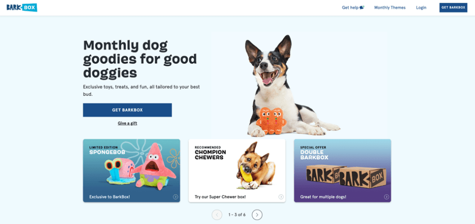
To that end, they have created two CTAs.
The more prominent one lets you order a box for your pooch, and the smaller one sends you to the gift section.
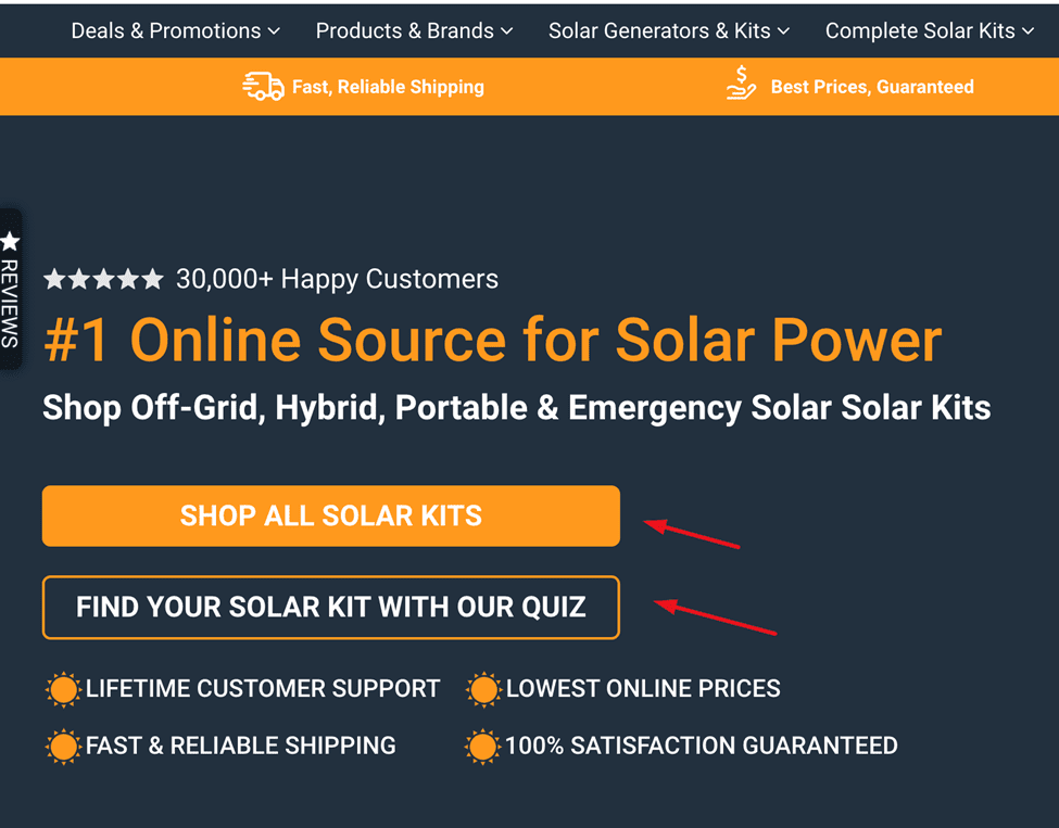
ShopSolarKits does an even better job with their two CTAs.
The first one sends you to browse the entirety of the brand’s offer, but the second one lets you take a quiz to help you decide which product is the right one for you.
Given the complexity of the product, this is the perfect conversion-boosting tool that also happens to be low risk and low effort.
Test the Color Red on CTAs and Buttons
Based on various research studies, we learned that different colors can have major impacts on conversion rates.
A study by Hubspot, comparing red and green CTAs, has found that red ones perform 21% better than green ones.
Similarly, Dmix has found that the red CTA button works 34% better than the green one.
Perhaps it has something to do with color psychology and the fact that red means stop, pay attention, this is important.
It may also just be because red is infinitely more noticeable than green.
Here’s a simple red CTA example from Vivion.
While their buttons are fairly small, they are red, which makes them pop instantly.
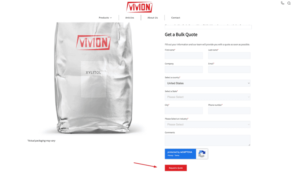
This gives you the space to play with other design elements on the page, assured in the knowledge that your red CTA will do the job for you.
Or Give Orange a Whirl
Alongside red, orange is another popular CTA color.
Science Daily shared interesting non-marketing research which indicated that hot chocolate tastes better in orange mugs, suggesting that the color is highly appealing to certain audiences.
In the world of marketing, some teams have found orange CTAs to perform better than blue or green buttons.
However, there is a caveat here. The orange only works if it’s the contrasting color to the rest of the page.
If you have a lot of orange on your landing page, the CTA will be better as another color, with green or even blue being superior options.
But if you use orange as an accent color, you can use it for the CTA as well, because it will still have that popping effect.
Let’s look at two great orange CTAs.
The first one comes to us from Ahrefs, whose orange CTA works marvelously because it is contrasted with the blue of the page.

Their design team has truly nailed color psychology and cleverly used their signature orange (from the Ahrefs logo) for all those tiny accents that make the page more dynamic.
Smartlook has done something similar, but they use orange only for the CTA.

They have also contrasted it with a white alternative CTA, which makes the orange one pop more, and it clearly highlights it as the more important option.
Use Your Brand as a CTA
Another way to ensure your CTAs convert more is to brand them.
This may be a challenge for some brands, while others will be able to do it more effortlessly.
The key is to actually be offering something uniquely yours, as you can’t brand your CTAs if you are reselling items.
A branded CTA will reinforce that all-important connection between yourself and your audience, and it will help make you more memorable.
It will also lend added value to your product or service.
What does a branded CTA look like? Here’s one for you from Thankbox and their online group retirement cards page:

Their “Create a Thankbox” CTA lets you create the said group card, but the fact that they are calling it a Thankbox makes them stand out from their competition.
This is not just some random card service — it’s a Thankbox!
Similarly, Prezi has several branded CTAs, in which they’ve merely added the name of the brand to their regular CTAs.
This makes the brand more memorable and unique, as opposed to similar products that have not taken this small extra step.
Don’t Ask Them to Convert
For certain brands, a non-converting CTA might also come in handy.
If you want to offer your audience a low-commitment and low-risk experience, you can make your most prominent CTA one that demands nothing.
This works especially well for brands that offer complex products or services that come with a high price tag or a high level of commitment.
If you don’t want to pressure your audience, this kind of CTA can make them feel more comfortable.
Instead of pushing for a sale, you will prove that you only care about ensuring your visitors and prospects find what they are looking for to solve a problem.
In the long run, this tactic is guaranteed to boost conversion rates.
WP Engine is a prime example of this tactic with their “Learn More” CTA.
You can see it in the chat box menu to the bottom right below:
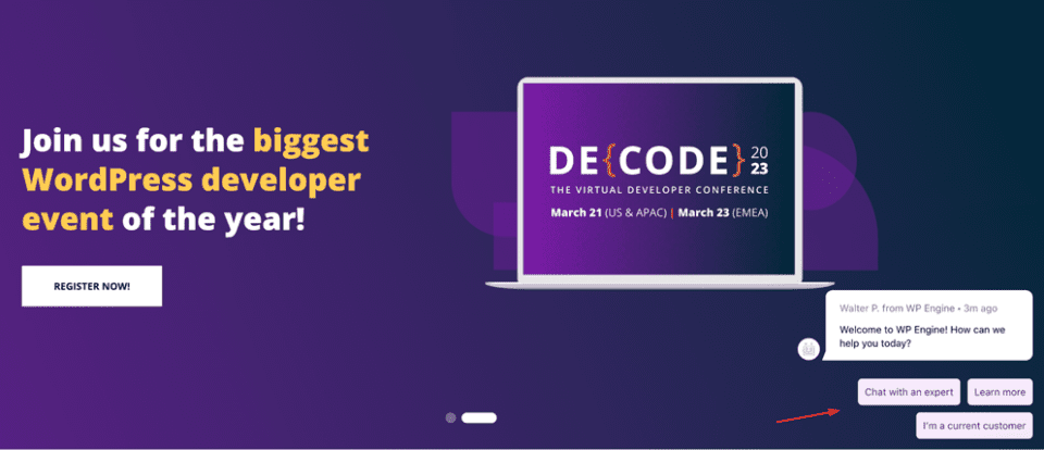
As you can see, WP Engine offers various products that are complex and perhaps difficult to understand.
Instead of making an assumption about the needs and knowledge levels of their audience, they start by helping educate visitors.
Don’t worry about this tactic alienating more experienced leads or those who know exactly what they want.
They will have no problem finding it via your main menu.
Multivariate or A/B Test CTA Variations
Finally, endless testing is perhaps the most important practice for creating quality CTAs.
Create several different versions: change the font, the color of the button, the text, and the placement.
Then, test each version against each of the others.
Keep in mind that you only want to test one change at a time, and and that change needs to be very obvious.
For example, don’t test green CTAs with one font placed on the right side of the page against orange CTAs with another font placed on the left side.
Stick to one element per test, and make sure the element you changed is obvious to anyone who sees it.
As you go through each test, incorporate what you have learned so far.
If you discover orange CTAs work well, keep them orange for all subsequent tests and tweak another element to see how that one stacks up.
Conclusion
These seven CTA best practices will help you craft buttons and other calls-to-action that direct traffic in a better flow, and boost conversion rates.
Note that you should always consider your overall page design and the needs of your audience before you blindly implement any of these tests.
This is the only way for you to ensure the best possible results.
Catherine Palmer
Latest posts by Catherine Palmer (see all)
- 6 Common CTA Mistakes That Are Killing Your Conversions - December 13, 2023
- 9 Types of Unique Content for Marketing (+Examples) - August 4, 2023
- 7 CTA Best Practices to Increase Conversions + 10 Great Examples - June 1, 2023


