Have you ever landed on a website only to feel overwhelmed, lost, or simply unimpressed by the product presentation?
How many times have you found yourself squinting at cluttered product descriptions. Or scratching your head trying to decipher the value of what’s offered?
We’ve all been there. The internet is full of businesses battling for attention.
While many may boast game-changing products, not all ace the art of presenting them.
Even the most groundbreaking product can get lost in translation if its digital presentation isn’t on point.
The game is tricky: You must tell your product’s story effectively.
Miss the mark, and you risk leaving your audience disengaged and bouncing off your page.
But hit the bullseye, and you’ve got visitors hooked, understood, and ready to buy.
So, how do you get there? Dive in with us as we break down six killer tactics that’ll ensure your product doesn’t just sit on your webpage, but truly stands out and resonates.
A Demo Speaks a Thousand Words
We’ve all heard that seeing is believing. Well, when it comes to doing business online, there’s no better way to breathe life into that phrase than with product demonstrations.
Why does this tactic work so well? Simply put, humans are visual creatures.
We gravitate towards what we can see and understand easily. Demos serve as that bridge between curiosity and clarity.
Think about it. When a visitor comes across a new product or service, they’re often bombarded with questions:
- “How does this work?”
- “Will it suit my needs?”
- “Is it user-friendly?”
A well-executed demo answers these questions, painting a clear picture of the product’s value, functionality, and user experience.
It’s like giving your visitors a test drive before they commit. Help them to visualize the benefits firsthand.
Now, let’s talk about eTraining, a company that truly understands the power of demonstrations.
Offering online workplace safety training, eTraining could easily overwhelm visitors with heaps of textual info about each course. But they opt for the smarter route.
By letting visitors preview courses through snappy, engaging videos, eTraining offers a clear window into their product.
Viewers aren’t left to imagine the course layout or interface. They see it, experience it, and know exactly what they’re signing up for.
This brilliant move by eTraining doesn’t only feed visitor curiosity – it converts that curiosity into enrollments.
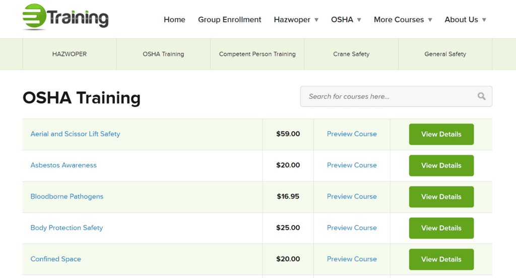
Source: etraintoday.com
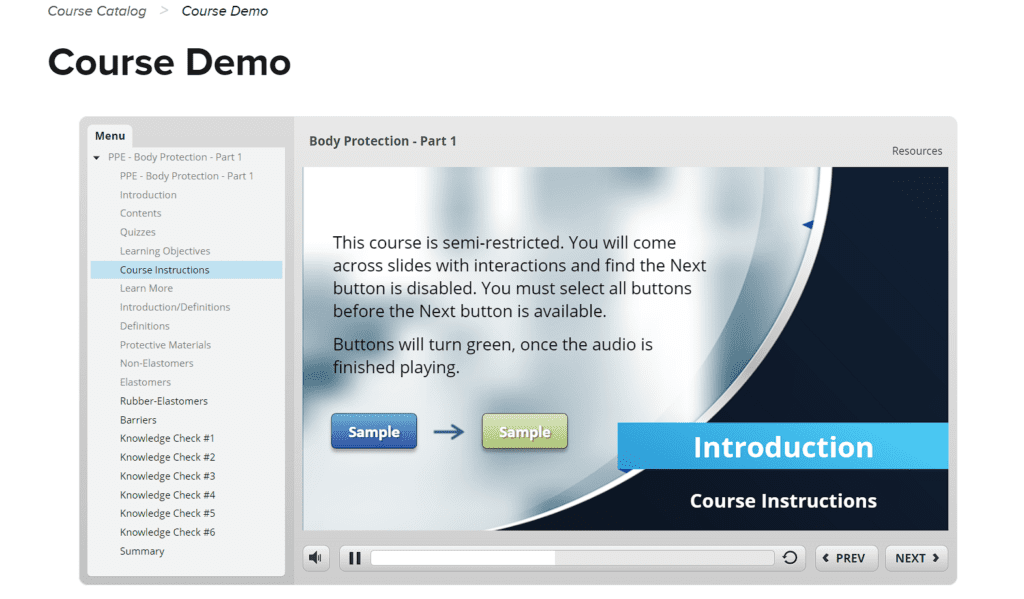
Source: etraintoday.com
Embrace Video and Animation
The digital market is evolving, and with it, the tools we use to present our products. Among them, video and animation stand out as kings of engagement.
With dwindling attention spans, you’ve got a narrow window to capture a visitor’s interest.
Text-heavy descriptions might work, but video and animation draw visitors in, playing to our innate love for stories, motion, and color.
The brilliance of video and animation lies in their ability to simplify. Complex processes or features can be distilled into bite-sized, digestible visuals that tell a story.
They bridge the gap between “What is this?” and “I get it now!” in a matter of seconds.
The best part is their versatility. From 3D product rotations to interactive animations, there’s a wealth of options to spotlight your product in a dynamic way.
Here are a few tips to get the most from both videos and animations:
- Keep it short and sweet.
Your goal isn’t to produce a feature-length movie. Aim for concise, engaging clips that hold attention. - Stay on-brand.
Your animations and videos should align with your brand’s look, feel, and voice. - Focus on benefits, not just features.
Show how your product improves lives, solves problems, or fills a gap. - Deliver high quality.
A pixelated, choppy video can do more harm than good. Invest in quality production for a polished look. - Test and iterate.
Use analytics to see how your videos perform. If they’re not hitting the mark, tweak, test, and refine.
Let’s take a peek at Duda, a masterclass in using animation effectively. As a professional website-building platform, Duda could easily delve into tech-heavy descriptions.
Instead, they place a crisp animation right beneath their main headline.
This animation isn’t just eye candy – it offers a visual guide, showcasing how their dashboard functions across mobile and desktop.
By doing so, they’ve transformed their potentially intricate service into something that feels intuitive.
Visitors aren’t left scratching their heads – they’re nodding along, thinking, “I feel ready to use this.”
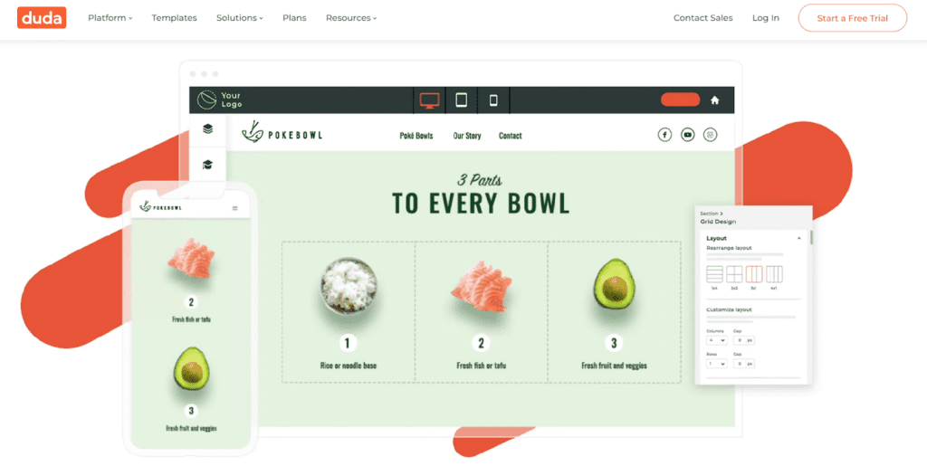
Source: duda.co
Don’t Skimp on Visuals if You’re Selling an Unconventional Product
Every now and then, a product comes along that disrupts the norm, challenges conventions, or simply fills a unique niche.
For those unfamiliar with the product, words might not suffice. They’re left wondering, “What does this do?” That’s where visuals come into play.
Imagery doesn’t just decorate your webpage. It elucidates, educates, and engenders trust. For unconventional products, visuals serve a dual purpose:
- First, they demystify. Instead of letting visitors guess or imagine, visuals provide clarity. They showcase the product’s design, its usage, and its benefits in tangible ways.
- Second, they validate. Visuals offer proof, showing potential buyers that this isn’t just an interesting idea – it’s a real, tangible product ready for purchase.
Here’s how to make visuals work for you:
- Diversify your visuals.
Don’t just stop at one product shot. Showcase it from multiple angles, in action and in various settings. And don’t be afraid to use different formats. - Invest in quality.
While it’s crucial to have diverse imagery, ensure each image is crisp, clear, and professionally shot. If it’s in the budget, invest in professional photography. - Use annotations.
If your product has unique features, use annotated images to highlight and explain them. - Consider infographics.
Sometimes, a well-designed infographic can explain a product’s benefits or usage better than paragraphs of text.
Enter SomniFix, a brand selling mouth strips designed for better sleep. Explaining the function and benefits of this kind of product through text alone might leave visitors befuddled. But SomniFix gets it.
On their mouth strips product page, they go all out with their visuals. They start with the product in its sleek packaging, then transition to its application in various situations.
Additionally, anatomical illustrations offer insight into how it aids in promoting better sleep, while instructional images ensure users get it right from the get-go.
This way, customers aren’t left guessing. They’re given a clear, visual roadmap of what SomniFix offers and how it works.
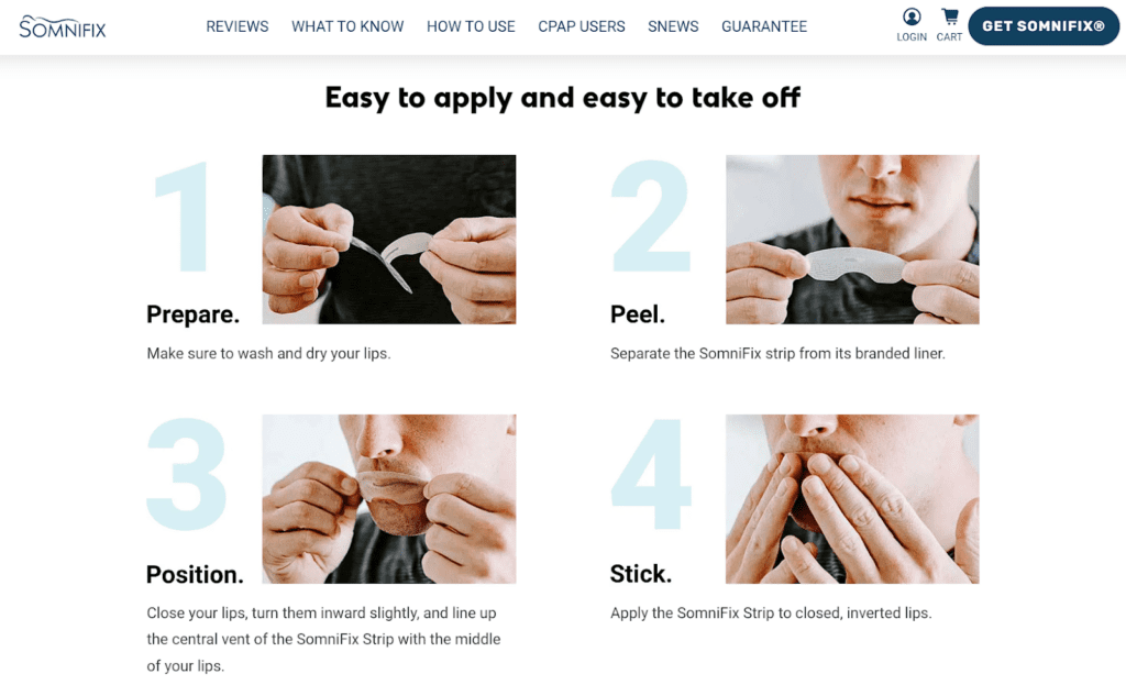
Source: somnifix.com
Discuss the Product’s Value in Measurable Terms
Numbers speak volumes. By quantifying the value of your product, you’re making a claim and a promise that potential customers can grasp, trust, and believe in.
This works because it’s concrete. While phrases like “significantly improves” or “dramatically reduces” are subjective, numbers offer a solid frame of reference.
They provide a benchmark for success and set clear expectations. And when used right, they can amplify the desirability of your product.
To nail this tactic expertly, follow these steps:
- Use real data.
Avoid ballpark figures. Use statistics and data derived from tests, customer feedback, or industry benchmarks. - Be transparent.
If your data comes from a study or third-party research, cite your sources. Authenticity fosters trust. - Highlight key metrics.
Not all data points are created equal. Spotlight metrics that resonate most with your target audience’s pain points or goals. - Keep it relatable.
Frame your metrics in ways that directly tie back to the user’s experience or benefits they’d gain. - Avoid overloading.
While data is powerful, avoid bombarding visitors with too many numbers. Prioritize and present what matters most.
A stellar example of this approach is Aura. Diving into this Amazon repricer software’s features, they could’ve gone the generic route, touting how they “increase sales” or “dominate the Buy Box.”
But they went a step further. Aura states you can “raise your sales by as little as 30%” and “control the Buy Box for 65%+ of the time.”
These metrics are direct, actionable, and promising.
For an Amazon seller eyeing those coveted sales and Buy Box positions, these statistics are more than numbers – they’re the solution they’ve been looking for.
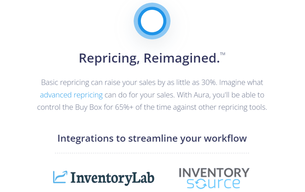
Source: goaura.com
Lean Heavily on Product-Centric UGC
When customers share their experiences, ask questions, or leave reviews, they’re interacting with your brand and crafting its narrative.
For potential buyers, this is gold. There’s an inherent trust in hearing from someone who’s been in their shoes, tried the product, and lived to tell the tale.
UGC is very effective because it’s relatable. Reading a review or FAQ from a fellow customer feels more genuine than a perfectly curated marketing message.
These nuggets of insight answer real-world questions, dispel doubts, and often spotlight benefits you hadn’t even considered.
To maximize the impact of product-centric UGC, consider these strategies:
- Prominently display reviews.
Don’t hide them away. Make sure they’re easily accessible and visible, preferably near product descriptions or pricing. - Encourage feedback.
Offer incentives or simple prompts to get customers to share their experiences. - Integrate Q&A sections.
Often, potential buyers have specific questions that aren’t addressed in your product description. A Q&A section, populated with actual customer queries, can fill this gap. - Engage with your customers.
If someone leaves a review or asks a question, engage. Thank them for the feedback or provide additional information. It shows that you’re listening and that you care.
Transparent Labs is a shining beacon of UGC done right. As a brand operating in the natural sports nutrition supplements space, they understand the power of real-world validation.
One visit to their 100% Grass-Fed Whey product page, and you’re greeted with a wealth of customer insights.
Detailed reviews provide a window into the product’s taste, mixability, results, and more. But they don’t stop there.
An integrated Q&A section caters to the curious, answering questions from protein sources to recommended servings.
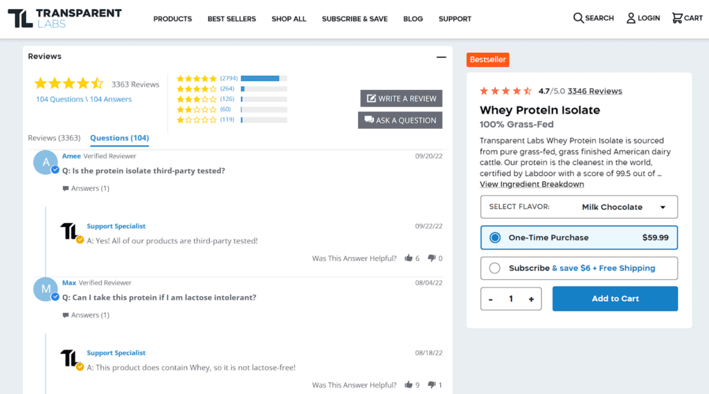
Source: transparentlabs.com
Allow Easy Product Comparisons if You Have a Large Inventory
When you’re offering a vast product inventory, your potential customers can easily feel overwhelmed. Too many options without clarity can result in analysis paralysis.
Here’s where product comparisons swoop in to save the day. These side-by-sides can guide buyers, helping them compare, evaluate, and hone in on the product that’s just right for their needs.
To expertly facilitate product comparisons:
- Standardize presentation.
Consistency is key. From product images to descriptions, ensure a standardized format to help illustrate easier and quicker comparisons. - Highlight key differences.
Not all features are equally important. Identify the main differentiators and place them front and center. - Provide interactive price updates.
If you allow product customization, ensure that any price alterations are reflected in real time. This aids in transparent and informed decision-making. - Incorporate filters and sorting options.
Allow users to filter products based on attributes, price ranges, ratings, etc. Sorting options can further enhance the comparison experience.
ShopSolar nails the art of product comparison. In the realm of solar power systems (a field that can easily bewilder the average consumer), they’ve managed to create an oasis of clarity.
On their Home Solar Kits category page, every product gets a detailed yet standardized description.
This consistency lets customers swiftly gauge one product against another.
But where ShopSolar truly shines (pun intended) is in its interactive experience.
Customers can play around with customizations and the prices adjust on the fly, ensuring there’s no sticker shock at checkout.
It’s this kind of user-centric design that transforms visitors into buyers, and ShopSolar’s approach is a masterclass in getting it right.
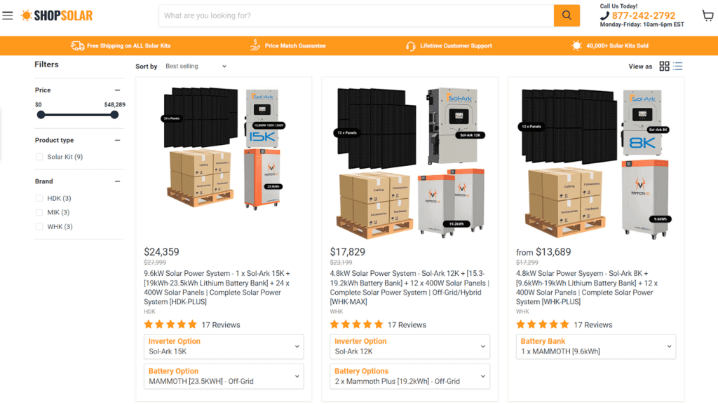
Source: shopsolarkits.com
Final Thoughts
With potential game-changers like augmented reality or AI-guided shopping on the horizon, the essence of effective product presentations remains the same: understanding and connecting with your visitor.
Every strategy we’ve discussed circles back to that.
It’s all about building a genuine conversation and providing value for your customers.
As you venture forward in the world of sales, remember: tools and trends change, but the art of truly resonating with your audience remains timeless.
Keep innovating, but always stay rooted in empathy and clarity.
Updated December 9, 2025