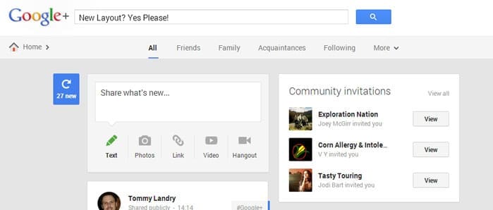
Google+ has come a very long way since its inception. Overall, they simply added features and functionality to Google Plus during the earlier months of its existence.
However, today they converted me over to their new interface. I must say, I like the changes! The entire User Experience has taken a major leap forward. It is easier to use and much more friendly on the eyes.
This post shares some highlights of the new layout. Give a read to the below, then jump over to Google Plus for yourself to see if you are also on the new version.
Multi-Column Layout
Taking a page from Pinterest, Google+ now sports a multi-column layout. The original was clearly their attempt to one-up Facebook at their own game.
Now, they have realized that a richer visual experience is superior to a bland news stream. They also figured out the power of a “pinboard” layout, which hearkens back to how newspapers have handled content for decades. For those of us who frequent Pinterest or have even spent any time on it for business purposes, the new Google Plus interface will be comfortable from the first second you lay eyes on it.
They even included a “refresh” button, a’la HootSuite, so you can see the new posts when you are ready to do so.
Check out the multi-column layout in the image provided below.
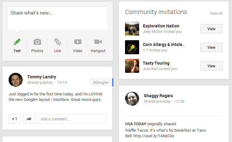
Community Invitations More Visible
As you can see in the image above, Community Invitations are now brought to the forefront of your stream. Google has really aimed to grow participation in Communities, so this move fits right in that line of thinking.
I have heard mixed reviews of experiences among the Communities. Some of them are high interaction and high value, while others turn into SPAM farms rather quickly. This is typical of any group setting, and we saw it previously on LinkedIn and in Facebook Groups.
Of course, several weeks after jumping in, I found it necessary to start weaning how many groups I view in the stream and which ones send me notifications of activity. Fortunately, my experience with groups so far has been of high quality. Perhaps it comes down to which communities you join, and how active the managers are in keeping them alive, moving along, and free of SPAM.
More Focus on Hangouts
Hangouts were always part of the plan for Google Plus. Although I have never taken to them, many of my professional colleagues tell a very different story.
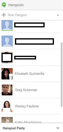
In the new layout, Hangouts are even more apparent. They own more real estate in the UI than they did in the previous version. I have yet to see how the new chat / video call interface compares to the old version, but I’d wager it is as slick of an improvement as the rest of the site.
You can view a screenshot of the new hangout view from the main Google Plus page to the right of this section.
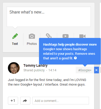
After Hashtags made their way onto Facebook a few weeks ago, we had to expect Google Plus to adopt them sooner or later. The answer came very quickly, and Hashtags are now a key piece of the sharing mechanism for Google Plus.
The cool part on Google Plus, though, is that I don’t even have to think about what hashtag to use for each post. They auto-tag it for me!
Some users may not like this, but no worries. Google has provided the ability to remove auto-appended hashtags before publishing the update. Great job at helping us take advantage of the power of hashtags, while still allowing enough control to customize to our particular needs or interests.
The whole “Circles” concept on Google Plus has always been interesting to me. It’s basically the opposite of Twitter Lists, where you can follow a group of people but not message them all at once. On Google Plus, we can circle someone and push messages over to them as a member of that circle.
Some users hate it when you push messages to them. I must say, I’ve received some SPAM and random content that was completely mis-targeted. There will always be people who abuse the feature, but that’s no reason to discount it completely.
If you use it responsibly, especially to start conversations with people who know you (very important part of this), circles are awesome. They are like mini-communities that you can build on your own, like Twitter lists, but with a way to contact them in aggregate. Now, you can get to a stream of their content faster and with a more rich experience attached. I like it.

Summary
These are the first few features I noticed during my initial visit to the new UI. I plan to spend more time exploring, and am certain there will be more areas of improvement.
Tommy Landry
Latest posts by Tommy Landry (see all)
- Forget SEO Hacks — AEO Is the Future Google AI Mode Is Built For - May 29, 2025
- Best AI Prompts for Digital Marketing - May 27, 2025
- AI-Driven Marketing Analytics and Attribution: Everything You Need To Know - May 20, 2025

