You’re a business owner who’s planning to build a foundation in the digital landscape. The only problem is that you don’t know where to begin.
This is one of the most common problems that fledgling online marketers face when expanding their online reach.
Fortunately, a lot of pioneers have shared some techniques on how you can achieve online success. And this is a great help to beginners like you.
Just like anything else, those who are just starting out need to learn the basics.
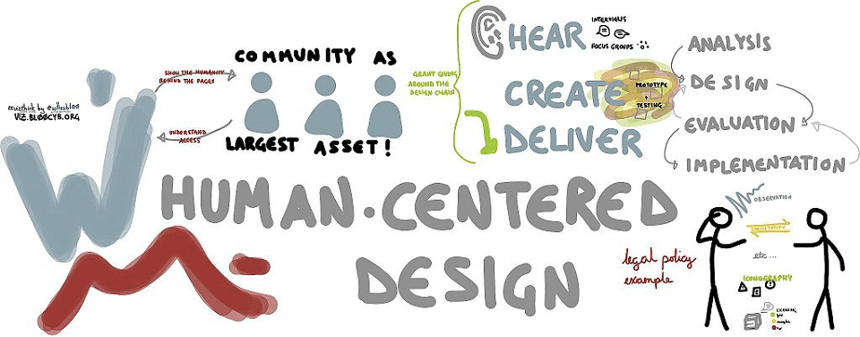
In SEO, this involves learning more about user-focused optimization.
This approach entails creating a memorable experience for users.
In fact, it has to be seamless enough to encourage visitors to convert and revisit your site.
So what do the pros suggest for maximum user-focused optimization? Read on to find out their suggestions below.
Boost Page Loading Times
The quickest way to make people leave your site is if your page takes too long to load.
Ideally, your page should load in less than a second so they can view your content as quickly as possible.
Putting this in perspective, Amazon estimates that businesses can lose over $1 billion if a website takes too long to load.
But how do you optimize loading time so visitors don’t bounce to your competitors?
Here are a few tips:
- Make sure that you’re using cloud hosting instead of shared hosting
- Optimize image size without skimping on quality
- Only use essential plug-ins
- Enable browser caching
- Keep your content short and punchy
By implementing these changes, you can attract more visitors and increase the chances of Google ranking your site higher on search engine result pages.
Organize Your Content
Now that your website is loading faster, you’ll need to make sure that you’re publishing quality content.
And that means your content should fly off the page so that it captures audience interest within seconds.
Why is it so important that you make a great first impression?
Take note that the average attention span of a person is only eight seconds.
It’s so short, in fact, that our attention span is a second shorter than that of a goldfish!
Keep in mind that users are searching for content which will answer their question right away.
As a result, they end up skimming content quickly before deciding if it contains all the relevant info they need.
To address the need for quick, relevant content, keep these factors in mind:
- Limit your paragraphs to no more than two or three sentences
- Use subheadings
- Use bullet points
- Craft captions that pique interest
- Insert relevant links into your content
Avoid writing long walls of text on your site, because it can cause reader fatigue.
With the tips above, you’ll be creating more white space.
This provides a visual breathing room for your readers.
Lastly, make it a point to follow a content hierarchy.
This involves placing the most important info on top of the page, then inserting supporting details right after it.
Follow a Minimalist Format
I recommend creating your site with a minimalist design.
This will ensure that you’re narrowing everything down to the bare essentials.
Growth Rocket is a great example of minimalist design used right.
The content is clear and concise, and it offers the visitor the necessary navigation buttons to help them explore the website further.
Take note of these pointers when designing the layout for your home page:
- Your logo should be placed on the top left corner of the page
- The top center should contain a navigation bar which provides in-depth links to the other pages
- The search bar should be found at the top right-hand side of the page
- The center of the page should include an overview of your company and/or your product or service
- The bottom should include your sign up form, social media links, contact info, and newsletter subscription
- The privacy policy and terms of service, should be at the bottom and take up the least space
- Minimize or avoid pop ups altogether
By following this format, the easier it is for visitors to find what they’re looking for.
That translates to a better user experience.
Follow Proper Font Psychology
Believe it or not, font plays a significant role in user experience because it sends a subtle message to readers.
After all, font size and style could say a lot about a brand.
For instance, an Austin SEO agency might choose Sans Serif for their site because it’s a font style associated with trust and sophistication.
As a result, it might seem rather weird for an ice cream company to use the same font style since they’re associated with more playful, creative designs.
Meanwhile, they might want to opt for a Script font instead since it’s more in line with feelings of joy, creativity, and happiness.
Many marketing experts explore font psychology because of its proven effectiveness.
So make sure you use a font that reflects your brand values.
Stay Mindful of Color Psychology
Color schemes don’t just exist for visual aesthetics.
They also play a crucial role in sending a subconscious message to your viewers the same way fonts do.
Growth Rocket offers another great example of this.
Upon checking its website, you’ll notice that it sticks to two primary colors: black and orange.
These colors are a great choice because:
- Black represents strength and authority
- Orange is a great accent color which helps boost brand awareness
To maximize user experience, your website should align with the color scheme on your logo, or if you have one, your overall branding palette / look and feel.
This way, you can achieve a more uniform look throughout your website.
Of course, you can add a few other colors to accentuate other aspects of your site.
User-Focused Optimization Yields Results
User-focused optimization isn’t overly complicated, as long as you remember to put the needs of your audience first.
Always offer value when you’re publishing content and keep your design consistent.
On top of that, make sure your website is easy to navigate to attract new and returning users.
Start your journey in improving your website today and watch a steady stream of visitors come pouring in.
Once you’ve mastered website user optimization, you’ll realize how much easier it is for you to achieve your overall business goals.
Feature Image Credit: CC 0; Public Domain. Feature image sourced from Wikimedia Commons.
Disclaimer: The views and opinions stated in this post are that of the author, and Return On Now may or may not agree with any or all of the commentary.
Aubrey Barcena
Latest posts by Aubrey Barcena (see all)
- Beginner’s Guide to Effective User-Focused Optimization - July 28, 2020


